The Complete Svelte 5 Course
Published Aug 14, 2025
Table of Contents
- What is Svelte?
- Try Svelte
- TypeScript Aside
- Single File Components
- Component Logic
- Markup Poetry
- Component Styles
- Svelte Reactivity
- Reactive State
- Deeply Reactive State
- Derived State
- Effects
- State In Functions And Classes
- Reactive Global State
- Why You Should Avoid Effects
- How Svelte Reactivity Works
- Using Template Logic
- Listening To Events
- Using Data Bindings
- Svelte Components
- Component Composition
- Transitions And Animations
- Using Third Party Libraries
- Special Elements
- Reactive Data Structures And Utilities
- Reactive Events
- Legacy Svelte
- Using Svelte With AI
What is Svelte?
If we read the definition from the Svelte website, it says:
Svelte is a UI framework that uses a compiler to let you write breathtakingly concise components that do minimal work in the browser, using languages you already know — HTML, CSS and JavaScript.
Because Svelte is a compiled language, it can wield the same syntax of a language that’s not great at making user interfaces like JavaScript and change the semantics for a better developer experience:
<script lang="ts">
	// reactive state
	let count = $state(0)

	// reassignment updates the UI
	setInterval(() => count += 1, 1000)
</script>

<p>{count}</p>
You might think how Svelte does some crazy compiler stuff under the hood to make this work, but the output is human readable JavaScript:
function App($$anchor) {
	// create signal
	let count = state(0)

	// update signal
	setInterval(() => set(count, get(count) + 1), 1000)

	// create element
	var p = from_html(`<p> </p>`)
	var text = child(p, true)

	// update DOM when `count` changes
	template_effect(() => set_text(text, get(count)))

	// add to DOM
	append($$anchor, p)
}
Svelte’s reactivity is based on signals, so there’s nothing magical about it — you could write Svelte code without a compiler, but it would be tedious like writing JSX by hand using functions.
Just by reading the output code, you can start to understand how Svelte works. There’s no virtual DOM, or rerendering the component when state updates like in React — Svelte only updates the part of the DOM that changed.
This is what “does minimal work in the browser” means!
Svelte also has a more opinionated application framework called SvelteKit (equivalent to Next.js for React) if you need routing, server-side rendering, adapters to deploy to different platforms and so on.
Try Svelte
You can try Svelte in the browser using the Svelte Playground and follow along without having to set up anything.
If you’re a creature of comfort and prefer your development environment, you can scaffold a Vite project and pick Svelte as the option from the CLI if you run npm create vite@latest in a terminal — you’re going to need Node.js for that.
I also recommend using the Svelte for VS Code extension for syntax highlighting and code completion, or a similar extension for your editor.
TypeScript Aside
TypeScript has become table stakes when it comes to frontend development. For that reason, the examples are going to use TypeScript, but you can use JavaScript if you prefer.
If you’re unfamiliar with TypeScript, code after : usually represents a type. You can omit the types and your code will work:
// TypeScript 👍️
let items: string[] = [...]

// JavaScript 👍️
let items = [...]
Some developers prefer writing JavaScript with JSDoc comments because it gives you the same benefits of TypeScript at the cost of a more verbose syntax:
/**
 * This is a list of items.
 * @type {string[]}
 */
let items = [...]
That is completely up to you!
Single File Components
In Svelte, files ending with .svelte are called single file components because they contain the JavaScript, HTML, and CSS in a single file.
Here’s an example of a Svelte component:
<!-- logic -->
<script lang="ts">
	let title = 'Svelte'
</script>

<!-- markup -->
<h1>{title}</h1>

<!-- styles -->
<style>
	h1 {
		color: orangered;
	}
</style>A Svelte component can only have one top-level <script> and <style> block and is unique for every component instance. A code formatter like Prettier might arrange the blocks for you, but the order of the blocks doesn’t matter.
There’s also a special <script module> block used for sharing code across component instances we’ll learn about later.
Component Logic
Your component logic goes inside the <script> tag. Since Svelte 5, TypeScript is natively supported:
<script lang="ts">
	let title = 'Svelte'
</script>

<h1>{title as string}</h1>
Later we’re going to learn how you can even define values inside your markup, which can be helpful in some cases.
Markup Poetry
In Svelte, anything that’s outside the <script> and <style> blocks is considered markup:
<!-- markup -->
<h1>Svelte</h1>
You can use JavaScript expressions in the template using curly braces and Svelte is going to evalute it:
<script lang="ts">
	let banana = 1
</script>

<p>There's {banana} {banana === 1 ? 'banana' : 'bananas'} left</p>Later we’re going to learn about logic blocks like {#if ...} and {#each ...} to conditionally render content.
Tags with lowercase names are treated like regular HTML elements by Svelte and accept normal attributes:
<img src="image.gif" alt="Person dancing" />You can pass values to attributes using curly braces:
<script lang="ts">
	let src = 'image.gif'
	let alt = 'Person dancing'
</script>

<img src={src} alt={alt} />If the attribute name and value are the same, you can use a shorthand attribute:
<!-- 👍️ longhand -->
<img src={src} alt={alt} />

<!-- 👍️ shorthand -->
<img {src} {alt} />
Attributes can have expressions inside the curly braces:
<script lang="ts">
	let src = 'image.gif'
	let alt = 'Person dancing'
	let lazy = true
</script>

<img {src} {alt} loading={lazy ? 'lazy' : 'eager'} />
You can spread objects on elements:
<script lang="ts">
	let obj = {
		src: 'image.gif',
		alt: 'Person dancing'
	}
</script>

<img {...obj} />
To conditionally render attributes, use null or undefined instead of && for short-circuit evaluation and empty strings:
<script lang="ts">
	let src = 'image.gif'
	let alt = 'Person dancing'
	let lazy = false
</script>

<!-- ⛔️ loading is `false` -->
<img {src} {alt} loading={lazy && 'lazy'} />

<!-- ⛔️ orphan attribute -->
<img {src} {alt} loading={lazy ? 'lazy' : ''} />

<!-- 👍 using `null` -->
<img {src} {alt} loading={lazy ? 'lazy' : null} />

<!-- 👍 using `undefined` -->
<img {src} {alt} loading={lazy ? 'lazy' : undefined} />
Component Styles
There are many ways you can style a Svelte component. 💅 I’ve heard people love inline styles with Tailwind CSS, so you could just use the style tag…I’m joking! 😄
That being said, the style tag can be useful. You can use the style attribute like in regular HTML, but Svelte also has a shorthand style: directive you can use. The only thing you can’t pass is an object:
<script lang="ts">
	let color = 'orangered'
</script>

<!-- 👍️ attribute -->
<h1 style="color: {color}">Svelte</h1>

<!-- 👍️ directive -->
<h1 style:color>Svelte</h1>

<!-- ⛔️ object -->
<h1 style={{ color }}>Svelte</h1>
You can even add important like style:color|important to override styles. The style: directive is also great for CSS custom properties:
<script lang="ts">
	let color = 'orangered'
</script>

<!-- 👍️ custom CSS property -->
<h1 style="--color: {color}">Svelte</h1>

<!-- 👍️ shorthand -->
<h1 style:--color={color}>Svelte</h1>

<style>
	h1 {
		/* custom CSS property with a default value */
		color: var(--color, #fff);
	}
</style>
Scoped Styles
Fortunately, you’re not stuck using the style attribute. Most of the time, you’re going to use the style block to define styles in your component. Those styles are scoped to the component by default:
<h1>Svelte</h1>

<!-- these styles only apply to this component -->
<style>
	h1 {
		color: orangered;
	}
</style>
Scoped styles are unique to that component and don’t affect styles in other components. If you’re using the Svelte playground, you can open the CSS output tab to view the generated CSS:
/* uniquely generated class name */
h1.svelte-ep2x9j {
	color: orangered;
}
If you want to define global styles for your app, you can import a CSS stylesheet at the root of your app:
// inside a Vite project
import { mount } from 'svelte'
import App from './App.svelte'
import './app.css'

const app = mount(App, {
  target: document.getElementById('app')!
})

export default app
You can also define global styles in components. This is useful if you have content from a content management system (CMS) that you have no control over.
Svelte has to “see” the styles in the component, so it doesn’t know they exist and warns you about removing unusued styles:
<script lang="ts">
	let content = `
		<h1>Big banana exposed</h1>
		<p>The gorillas inside the banana cartel speak out</p>
	`
</script>

<article>
	{@html content}
</article>

<style>
	article {
		/* ⚠️ Unused CSS selector "h1" */
		h1 {
			text-transform: capitalize;
		}

		/* ⚠️ Unused CSS selector "p" */
		p {
			text-wrap: pretty;
		}
	}
</style>@html tag is used to render raw HTML in Svelte components. If you don't control the content, always sanitize user input to prevent XSS attacks.In that case, you can make the styles global by using the :global(selector) modifier:
<!-- ... -->
<style>
	article {
		:global(h1) {
			text-transform: capitalize;
		}

		:global(p) {
			text-wrap: pretty;
		}
	}
</style>
Having to use :global on every selector is tedious! Thankfully, you can nest global styles inside a :global { ... } block:
<!-- ... -->
<style>
	:global {
		article {
			h1 {
				text-transform: capitalize;
			}

			p {
				text-wrap: pretty;
			}
		}
	}
</style>
You can also have “global scoped styles” where the styles inside the :global block are scoped to the class:
<!-- ... -->
<style>
	article :global {
		h1 {
			text-transform: capitalize;
		}

		p {
			text-wrap: pretty;
		}
	}
</style>
Here’s the compiled CSS output:
article.svelte-ju1yn8 {
	h1 {
		text-transform: capitalize;
	}

	p {
		text-wrap: pretty;
	}
}
Keyframe animations are also scoped to the component. If you want to make them global, you have to prepend the keyframe name with -global-. The -global- part is removed when compiled, so you can reference the keyframe name in your app:
<style>
	@keyframes -global-animation {
		/* ... */
	}
</style>
You can use different preprocessors like PostCSS or SCSS by simply adding the lang attribute to the <style> tag with the preprocessor you want to use:
<style lang="postcss">
	<!-- ... -->
</style>

<style lang="scss">
	<!-- ... -->
</style>
These days you probably don’t need SCSS anymore, since a lot of features such as nesting and CSS variables are supported by CSS.
Dynamic Classes
You can use an expression to apply a dynamic class, but it’s tedious and easy to make mistakes:
<script lang="ts">
	let open = $state(false)
</script>

<button onclick={() => open = !open}>
	<span>Accordion</span>
	<span class="trigger {open ? 'open' : ''}">👈️</span>
</button>

<style>
	.trigger {
		display: inline-block;
		transition: rotate 0.2s ease;

		&.open {
			rotate: -90deg;
		}
	}
</style>Thankfully, Svelte can helps us out here. You can use the class: directive to conditionally apply a class:
<span class="trigger" class:open>👈️</span>You can also pass an object, array, or both to the class attribute and Svelte is going to use clsx under the hood to merge the classes:
<!-- 👍️ passing an object -->
<span class={{ trigger: true, open }}>👈️</span>

<!-- 👍️ passing an array -->
<span class={['trigger', open && 'open']}>👈️</span>

<!-- 👍️ passing an array and object -->
<span class={['trigger', { open }]}>👈️</span>
If you’re using Tailwind, this is very useful when you need to apply a bunch of classes:
<span class={['transition-transform', { '-rotate-90': open }]}>👈️</span>Also consider using data attributes for explicit transition states for easier orchestration, instead of using a bunch of classes:
<script lang="ts">
	let status = $state('closed')
</script>

<span class="trigger" data-status={status}>👈️</span>

<style>
	.trigger {
		display: inline-block;
		transition: rotate 0.2s ease;

		&[data-status="closed"] {
			rotate: 0deg;
		}

		&[data-status="open"] {
			rotate: -90deg;
		}
	}
</style>
Svelte Reactivity
In the context of JavaScript frameworks, application state refers to values that are essential to your application working and cause the framework to update the UI when changed.
Let’s look at a counter example:
<!-- only required for this example because of legacy mode -->
<svelte:options runes={true} />

<script lang="ts">
	let count = 0
</script>

<button onclick={() => count += 1}>
	{count}
</button>
The Svelte compiler knows that you’re trying to update the count value and warns you because it’s not reactive:
countis updated, but is not declared with$state(...). Changing its value will not correctly trigger updates.
This brings us to our first Svelte rune — the $state rune.
Reactive State
The $state rune marks a variable as reactive. Svelte’s reactivity is based on assignments. To update the UI, you just assign a new value to a reactive variable:
<script lang="ts">
	// reactive value
	let count = $state(0)
</script>

<!-- reactive assignment -->
<button onclick={() => count += 1}>
	Count: {count}
</button>You can open the developer tools and see that Svelte only updated the part of the DOM that changed.
count += 1 to emphasize assignment, but using count++ to increment the value also works.The $state(...) syntax is called a rune and is part of the language. It looks like a function, but it’s only a hint for the Svelte compiler to know what to do with it. This also means as far as TypeScript is concerned, it’s just a function:
let value = $state<Type>(...)The three main runes we’re going to learn about are the $state, $derived, and $effect rune.
Deeply Reactive State
If you pass an array, or object to $state it becomes a deeply reactive Proxy. This lets Svelte perform granular updates when you read or write properties and avoids mutating the state directly.
For example, changing editor.content is going to update the UI in every place where it’s used:
<script lang="ts">
	let editor = $state({
		theme: 'dark',
		content: '<h1>Svelte</h1>'
	})
</script>

<textarea
	value={editor.content}
	oninput={(e) => editor.content = (e.target as HTMLTextAreaElement).value}
	spellcheck="false"
></textarea>

{@html editor.content}

<style>
	textarea {
		width: 600px;
		height: 200px;
		padding: 1rem;
		border-radius: 0.5rem;
	}
</style>$state.raw
You might not want deeply reactive state, where pushing to an array or updating the object would cause an update. In that case, you can use $state.raw so state only updates when you reassign it:
<script lang="ts">
	// this could be a complex data structure
	let editor = $state.raw({
		theme: 'dark',
		content: '<h1>Svelte</h1>'
	})
</script>

<textarea
	value={editor.content}
	oninput={(e) => {
		// ⛔️ can't be mutated
		editor.content = e.target.value

		// 👍️ reassignment
		editor = {
			...editor,
			content: e.target.value
		}
	}}
	spellcheck="false"
></textarea>

{@html editor.content}

<style>
	textarea {
		width: 100%;
		height: 200px;
	}
</style>
$state.snapshot
Because proxied state is deeply reactive, you could change it on accident when you pass it around, or run into a problem with some API that doesn’t expect it. In that case, you can use $state.snapshot to get the normal value from the Proxy:
function saveEditorState(editor) {
	// 💣️ oops! it doesn't like a Proxy object...
	const editorState = structuredClone(editor)
	// 👍️ normal object
	const editorState = structuredClone($state.snapshot(editor))
}

// later
saveEditorState(editor)$state.snapshot when you console.log deeply reactive values for convenience.Destructuring
You can destructure deep state where you defined it — but if you destructure it anywhere else — it loses reactivity because it’s just JavaScript, so the values are evaluated when you destructure them:
<script lang="ts">
	// 👍️ reactive
	let { theme, content } = $state({
		theme: 'dark',
		content: '<h1>Svelte</h1>'
	})

	// ⛔️ not reactive
	let { theme, content } = editor
</script>

{@html content}
If you want to do this, you can use derived state!
Derived State
You can derive state from other state using the $derived rune and it’s going to reactively update:
<script lang="ts">
	let count = $state(0)
	let factor = $state(2)
	let result = $derived(count * factor)
</script>

<p>{count} * {factor} = {result}</p>

<button onclick={() => count++}>Count: {count}</button>
<button onclick={() => factor++}>Factor: {factor}</button>Deriveds Only Update When They Change
Derived values only run when they’re read and are lazy evaluted which means they only update when they change, and not when their dependencies change to avoid unnecessary work.
Here even if max depends on count, it only updates when max updates:
<script lang="ts">
	let count = $state(0)
	let max = $derived(count >= 4)

	// only logs when `max` changes
	$inspect(max)
</script>

<button onclick={() => count++} disabled={max}>
	{count}
</button>$inspect rune only runs in development and is great for seeing state updates and debugging.Derived Dependency Tracking
You can pass a function with state to a derived without losing reactivity:
<script lang="ts">
	let count = $state(0)
	let max = $derived(limit())

	function limit() {
		return count > 4 // 📖
	}
</script>

<button onclick={() => count++} disabled={max}>
	{count}
</button>
This might sound like magic, but the only magic here is the system of signals and runtime reactivity! 🪄 In a later section, we’re going to learn how this exactly works.
The reason you don’t have to pass state to the function — unless you want to be explicit — is because signals only care where they’re read, as highlighted in the compiled output.
Passing state as argument:
let disabled = derived(() => limit(get(count))) // 📖

function limit(count) {
	return count > 4
}
Not passing any arguments:
let disabled = derived(limit())

function limit() {
	return get(count) > 4 // 📖
}
The only thing that matters is that count is read and tracked inside of an effect, so the limit function reruns when it updates.
$derived.by
The $derived rune only accepts an expression by default, but you can use the $derived.by rune for more complex derivations:
<script lang="ts">
	let cart = $state([
		{ item: '🍎', total: 10 },
		{ item: '🍌', total: 10 }
	])
	let total = $derived.by(() => {
		let sum = 0
		for (let item of cart) {
			sum += item.total
		}
		return sum
	})
</script>

<p>Total: {total}</p>Svelte recommends you keep deriveds free of side-effects and you can’t update state inside of deriveds to protect you from unintended side-effects:
<script lang="ts">
	let count = $state(0)
	let double = $derived.by(() => {
		// ⛔️ error
		count++
	})
</script>
Destructuring From Deriveds
Going back to the previous example, you can also use derived state to keep reactivity when using destructuring:
<script lang="ts">
	let editor = $state({
		theme: 'dark',
		content: '<h1>Svelte</h1>'
	})

	// ⛔️ not reactive
	let { theme, content } = editor

	// 👍️ reactive
	let { theme, content } = $derived(editor)
</script>

{@html content}
Effects
The last rune in the holy trinity of reactivity in Svelte you should know about is the $effect rune.
Effects are functions that run when the component is added to the DOM and when their dependencies change. State that is read inside of an effect will be tracked.
Here count is going to be logged when it updates, since it’s read inside of the effect and tracked as a dependency:
<script lang="ts">
	let count = $state(0)

	$effect(() => {
		// 🕵️ tracked
		console.log(count)
	})
</script>

<button onclick={() => count++}>Click</button>
Values are only tracked if they’re read — here if condition is true, then condition and count are going to be tracked, but if condition is false, then the effect only reruns when condition changes:
<script lang="ts">
	let count = $state(0)
	let condition = $state(false)

	$effect(() => {
		// 👍️ tracked
		if (condition) {
			// ⛔️ not tracked
			console.log(count)
		}
	})
</script>

<button onclick={() => count++}>Click</button>
<button onclick={() => condition = !condition}>Toggle</button>You can return a function from the effect callback, which reruns when the effect dependencies change, or when the component is removed from the DOM.
Values that are read asynchronously like inside promises and timers are not tracked inside effects:
<script lang="ts">
	let count = $state(0)
	let delay = $state(1000)

	$effect(() => {
		// 🕵️ only `delay` is tracked
		const interval = setInterval(() => count++, delay)
		// 🧹 clear interval every update
		return () => clearInterval(interval)
	})
</script>

<button onclick={() => delay *= 2}>slower</button>
<span>{count}</span>
<button onclick={() => delay /= 2}>faster</button>
Svelte provides an untrack function if you don’t want state to be tracked:
<script lang="ts">
	import { untrack } from 'svelte'

	let a = $state(0)
	let b = $state(0)

	$effect(() => {
		// ⚠️ only logs when `b` changes
		console.log(untrack(() => a) + b)
	})
</script>

<button onclick={() => a++}>A</button>
<button onclick={() => b++}>B</button>
Effect Dependency Tracking
When it comes to deeply reactive state, effects only rerun when the object it reads changes and not its properties:
<script lang="ts">
	let obj = $state({ current: 0 })
	let arr = $state([])

	$effect(() => {
		// ⛔️ not tracked
		console.log(obj)
		// 👍️ tracked
		console.log(obj.current)
	})

	$effect(() => {
		// ⛔️ not tracked
		console.log(arr)
		// 👍️ tracked
		console.log(arr.length)
	})

	// later
	obj.current++
	arr.push(1)
</script>
There are exceptions to the rule! If you use JSON.stringify or $state.snapshot, then everything is tracked:
<script lang="ts">
	let obj = $state({ current: 0 })
	let arr = $state([])

	$effect(() => {
		JSON.stringify(obj) // 👍️ tracked
	})

	$effect(() => {
		JSON.stringify(arr) // 👍️ tracked
	})
</script>
When Not To Use Effects
In general, you should always avoid effects and never use effects to synchronize state, because Svelte queues your effects to ensure they run in the correct order and runs them last.
Using effects to synchronize state can cause unexpected behavior like state being out of sync:
<script lang="ts">
	let count = $state(0)
	let double = $state(0)

	$effect(() => {
		// effects run last
		double = count * 2
	})
</script>

<button onclick={() => {
	count++ // 1
	console.log(double) // ⚠️ 0
}}>
	{double}
</button>
Always derive state when you can instead:
<script lang="ts">
	let count = $state(0)
	let double = $derived(count * 2)
</script>

<button onclick={() => {
	count++ // 1
	console.log(double) // 👍️ 2
}}>
	{double}
</button>If you want to do something when the component is added to the DOM and don’t care about tracking state, you can use the onMount lifecycle function instead of an effect:
<script lang="ts">
	import { onMount } from 'svelte'

	onMount(() => {
		console.log('Component added 👋')
		return () => console.log('🧹 Component removed')
	})
</script>async callbacks to onMount and $effect as their cleanup won't run. You can use async functions, or an IIFE instead.When To Use Effects
Effects should be a last resort when you have to synchronize with an external system that doesn’t understand Svelte’s reactivity. They should only be used for side-effects like fetching data from an API, or working with the DOM directly.
In this example, we’re using the Pokemon API and getAbortSignal from Svelte to avoid making a bunch of requests when searching for a Pokemon:
<script lang="ts">
	import { getAbortSignal } from 'svelte'

	let pokemon = $state('charizard')
	let image = $state('')

	async function getPokemon(pokemon: string) {
		const baseUrl = 'https://pokeapi.co/api/v2/pokemon'
		const response = await fetch(`${baseUrl}/${pokemon}`, {
			// aborts when derived and effect reruns
			signal: getAbortSignal()
		})
		if (!response.ok) throw new Error('💣️ oops!')
		return response.json()
	}

	$effect(() => {
		getPokemon(pokemon).then(data => {
			image = data.sprites.front_default
		})
	})
</script>

<input
	type="search"
	placeholder="Enter Pokemon name"
	oninput={(e) => pokemon = (e.target as HTMLInputElement).value}
/>
<img src={image} alt={pokemon} />

<style>
	input {
		padding: 1rem;
		border-radius: 1rem;
	}

	img {
		width: 200px;
		display: block;
		margin-top: 1rem;
		image-rendering: pixelated;
	}
</style>$effect.pre
Your effects run after the DOM updates in a microtask, but sometimes you might need to do work before the DOM updates like measuring an element, or scroll position — in that case, you can use the $effect.pre rune.
Let’s look at an example that uses the GSAP Flip plugin to animate changes in the DOM and needs to measure the position, size, and rotation of elements before, and after the DOM update.
In this example, we measure the elements before the DOM updates, and use tick to wait for the DOM update:
<script lang="ts">
	import { gsap } from 'gsap'
	import { Flip } from 'gsap/Flip'
	import { tick } from 'svelte'

	gsap.registerPlugin(Flip)

	let items = $state([...Array(10).keys()])

	$effect.pre(() => {
		// track `items` as a dependency
		items
		// measure elements before the DOM updates
		const state = Flip.getState('.item')
		// wait for the DOM update
		tick().then(() => {
			// do the FLIP animation
			Flip.from(state, { duration: 1, stagger: 0.01, ease: 'power1.inOut' })
		})
	})

	function shuffle() {
		items = items.toSorted(() => Math.random() - 0.5)
	}
</script>

<div class="container">
	{#each items as item (item)}
		<div class="item">{item}</div>
	{/each}
</div>

<button onclick={shuffle}>Shuffle</button>

<style>
	.container {
		width: 600px;
		display: grid;
		grid-template-columns: repeat(5, 1fr);
		gap: 0.5rem;
		color: orangered;
		font-size: 3rem;
		font-weight: 700;
		text-shadow: 2px 2px 0px #000;

		.item {
			display: grid;
			place-content: center;
			aspect-ratio: 1;
			background-color: #222;
			border: 1px solid #333;
			border-radius: 1rem;
		}
	}

	button {
		margin-top: 1rem;
		font-size: 2rem;
	}
</style>tick function is a lifecyle function that uses the queueMicrotask method to schedule a task to run in the next microtask when all the work is done, and before the DOM updates.State In Functions And Classes
So far, we only used runes at the top-level of the component, but you can use state, deriveds, and effects inside functions and classes.
You can use runes in a JavaScript module by using the .svelte.js or .svelte.ts extension to tell Svelte that it’s a special file, so it doesn’t have to check every file for runes.
Here’s a createCounter function that holds and returns the count state:
export function createCounter(initial: number) {
	let count = $state(initial)

	return {
		get count() { return count },
		set count(v) { count = v }
	}
}
Here’s how it’s used inside of a Svelte component:
<script lang="ts">
	import { createCounter } from './counter.svelte'

	const counter = createCounter(0)
</script>

<button onclick={() => counter.count--}>-</button>
<span>{counter.count}</span>
<button onclick={() => counter.count++}>+</button>
Reactive Properties
You’re probably wondering, what’s the deal with the get and set methods?
Those are called getters and setters, and they create accessor properties which let you define custom behavior when you read and write to a property.
They’re just part of JavaScript, and you could use functions instead:
export function createCounter(initial: number) {
	let count = $state(initial)

	return {
		count() { return count },
		setCount(v: number) { count = v }
	}
}
You could return a tuple instead to make the API nicer and destructure the read and write functions like let [count, setCount] = createCounter(0).
As you can see, the syntax is not as nice compared to using accessors, since you have to use functions everywhere:
<!-- using functions -->
<button onclick={() => counter.setCount(counter.count() + 1)}>
	{counter.count()}
</button>

<!-- using accessors -->
<button onclick={() => counter.count++}>
	{counter.count}
</button>
Reactive Containers
The accessor syntax looks a lot nicer! 😄 You might be wondering, can’t you just return state from the function?
export function createCounter(initial: number) {
	let count = $state(initial)
	// ⛔️ this doesn't work
	return { count }
}
The reason this doesn’t work is because state is just a regular value and not some magic reactive container. If you want something like that, you could return deeply reactive proxied state:
export function createCounter(initial: number) {
	let counter = $state({ count: initial })
	// 👍️ proxied state
	return counter
}
You can create a reactive container if you want:
// reactive container utility
function reactive<T>(value: T) {
	let state = $state<T>(value)
	return state
}

function createCounter(initial: number) {
	// reactive container
	let counter = reactive({ count: initial })
	return { counter }
}
Even destructuring works, since counter is not just a regular value:
<script lang="ts">
	import { createCounter } from './counter.svelte'

	const { counter } = createCounter(0)
</script>

<button onclick={() => counter.count++}>
	{counter.count}
</button>
That seems super useful, so why doesn’t Svelte provide this utility?
It’s mostly because it’s a few lines of code, but another reason is classes. If you use state inside classes, you get extra benefits which you don’t get using functions.
Svelte turns any class fields declared with state into private fields with matching get/set methods, unless you declare them yourself:
export class Counter {
	constructor(initial: number) {
		// turned into `get`/`set` methods
		this.count = $state(initial)
	}

	increment() {
		this.count++
	}

	decrement() {
		this.count--
	}
}
If you look at the output, you would see something like this:
class Counter {
	#count
	get count() { ... }
	set count(v) { ... }
}
There’s only one gotcha with classes and it’s how this works.
For example, using a method like counter.increment inside onclick doesn’t work, because this refers to where it was called:
<script lang="ts">
	import { Counter } from './counter.svelte'

	const counter = new Counter(0)
</script>

<button onclick={counter.decrement}>-</button>
<span>{counter.count}</span>
<button onclick={counter.increment}>+</button>
You can see it for yourself:
increment() {
	console.log(this) // button
	this.count++
}

decrement() {
	console.log(this) // button
	this.count--
}
You either have to pass an anonymous function like () => counter.increment() to onclick, or define the methods using arrow functions that don’t bind their own this:
increment = () =>
	console.log(this) // class
	this.current++
}

decrement = () => {
	console.log(this) // class
	this.current--
}
The only downside with arrow functions is that you’re creating a new function every time time you call it, but everything works as expected.
Passing State Into Functions And Classes
Because state is a regular value, it loses reactivity when you pass it into a function or a class.
In this example, we pass count into Doubler to double the value when count updates. However, it’s not reactive since count is a regular value:
<script lang="ts">
	class Doubler {
		constructor(count: number) {
			this.count = $derived(count * 2) // get(count) * 2
		}
	}

	let count = $state(0)
	const double = new Doubler(count) // get(count)
</script>

<button onclick={() => count++}>
	{double.count}
</button>
Svelte even gives you a warning with a hint:
This reference only captures the initial value of
count. Did you mean to reference it inside a closure instead?
To get the latest count value, we can pass a function instead:
<script lang="ts">
	class Doubler {
		constructor(count: () => number) {
			this.count = $derived(count() * 2) // () => get(count) * 2
		}
	}

	let count = $state(0)
	const double = new Doubler(() => count) // () => get(count)
</script>

<button onclick={() => count++}>
	{double.count}
</button>
Also, we already have a reactive Counter class we can use:
<script lang="ts">
	class Counter {
		constructor(initial: number) {
			this.count = $state(initial)
		}
	}

	class Doubler {
		constructor(counter: Counter) {
			this.count = $derived(counter.count * 2)
		}
	}

	const counter = new Counter(0)
	const double = new Doubler(counter)
</script>

<button onclick={() => counter.count++}>
	{double.count}
</button>
Runes are reactive primitives that give you the flexibility to create your own reactivity system.
Reactive Global State
Creating global reactive state in Svelte is simple as exporting deep state from a module, like a config which can be used across your app:
interface Config {
	theme: 'light' | 'dark'
}

export const config = $state<Config>({ theme: 'dark' })

export function toggleTheme() {
	config.theme = config.theme === 'light' ? 'dark' : 'light'
}<script>
import { config, toggleTheme } from './config.svelte'
</script>
<button onclick={toggleTheme}>
{config.theme}
</button>You could use a function, or a class for the config:
type Themes = 'light' | 'dark'

class Config {
	theme = $state<Themes>('dark')

	toggleTheme() {
		this.theme = this.theme === 'light' ? 'dark' : 'light'
	}
}

export const config = new Config()
It doesn’t matter if you use functions or classes, as long as you understand how Svelte reactivity works.
Why You Should Avoid Effects
I don’t want to scare you from using effects. Honestly, it’s not a big deal if you sometimes use effects when you shouldn’t.
It’s unlikely your app would be worse just by using effects — the actual problem is that it’s easy to overcomplicate your code with effects, because it seems like the right thing to do.
In this example, we’re using the Web Storage API to read and write the counter value each time it updates. Hey, that’s a side-effect! Using an effect seems resonable:
class Counter {
	constructor(initial: number) {
		this.count = $state(initial)

		$effect(() => {
			const savedCount = localStorage.getItem('count')
			if (savedCount) this.count = parseInt(savedCount)
		})

		$effect(() => {
			localStorage.setItem('count', this.count.toString())
		})
	}
}
The problem only arises if you create the counter outside the component initialization phase (in a separate module, or inside of an event handler):
export const counter = new Counter(0)Oops! Immediately, there’s an effect_orphan error:
$effectcan only be used inside an effect (e.g. during component initialisation).
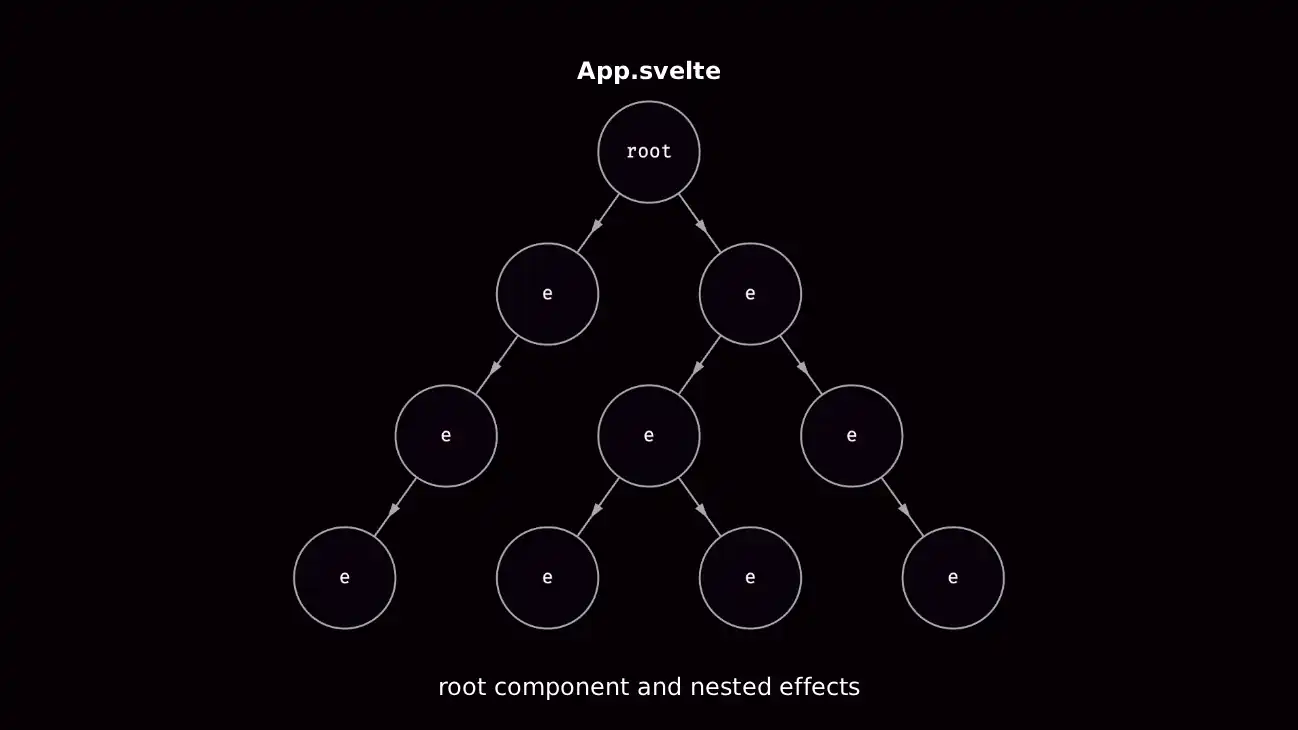
Your entire app is a root effect with other nested effects, so Svelte can run the teardown logic for them when the component is removed — in this case, you’re trying to create an effect outside that root effect, so Svelte can’t keep track of it.
Svelte provides an advanced $effect.root rune to create your own root effect, but now you have to run the cleanup manually:
class Counter {
#cleanup
constructor(initial: number) {
this.count = $state(initial)
// manual cleanup 😮💨
this.cleanup = $effect.root(() => {
$effect(() => {
const savedCount = localStorage.getItem('count')
if (savedCount) this.count = parseInt(savedCount)
})
$effect(() => {
localStorage.setItem('count', this.count.toString())
})
return () => console.log('🧹 cleanup')
})
}
destroy() {
this.#cleanup()
}
}Awkward! 😄 Then you learn about the $effect.tracking rune, used to know if you’re inside a tracking context like the effect in your template, so maybe that’s the solution?
class Counter {
	constructor(initial: number) {
		this.count = $state(initial)

		if ($effect.tracking()) {
			$effect(() => {
				const savedCount = localStorage.getItem('count')
				if (savedCount) this.count = parseInt(savedCount)
			})

			$effect(() => {
				localStorage.setItem('count', this.count.toString())
			})
		}
	}
}
But there’s another problem! The effect is never going to run when the counter is created, because you’re not inside a tracking context. 😩
It would make more sense to move the effect where you read the value — this way, it’s read inside of a tracking context like the template effect:
export class Counter {
	constructor(initial: number) {
		this.#count = $state(initial)
	}

	get count() {
		if ($effect.tracking()) {
			$effect(() => {
				const savedCount = localStorage.getItem('count')
				if (savedCount) this.#count = parseInt(savedCount)
			})
		}
		return this.#count
	}

	set count(v: number) {
		localStorage.setItem('count', v.toString())
		this.#count = v
	}
}
There’s another problem. Each time we read the value, we’re creating an effect! 😨 That’s a simple fix — we can use a variable to track if we already ran the effect:
export class Counter {
	#first = true

	constructor(initial: number) {
		this.#count = $state(initial)
	}

	get count() {
		if ($effect.tracking()) {
			$effect(() => {
				if (!this.#first) return
				const savedCount = localStorage.getItem('count')
				if (savedCount) this.#count = parseInt(savedCount)
				this.#first = false
			})
		}
		return this.#count
	}

	set count(v: number) {
		localStorage.setItem('count', v.toString())
		this.#count = v
	}
}
In reality, none of this is necessary — you can make everything simpler by doing side-effects inside event handlers like onclick instead of using effects. In fact, we can just remove the effect and everything works:
export class Counter {
	#first = true

	constructor(initial: number) {
		this.#count = $state(initial)
	}

	get count() {
		if (this.#first) {
			const savedCount = localStorage.getItem('count')
			if (savedCount) this.#count = parseInt(savedCount)
			this.#first = false
		}
		return this.#count
	}

	set count(v: number) {
		localStorage.setItem('count', v.toString())
		this.#count = v
	}
}
Unless you know what you’re doing — if you catch yourself using advanced runes like $effect.root or $effect.tracking, you’re doing something wrong.
How Svelte Reactivity Works
I believe that understanding how something works gives you greater enjoyment in life by being more competent at what you do.
I mentioned how Svelte uses signals for reactivity, but so do many other frameworks like Angular, Solid, Vue, and Qwik. There’s even a proposal to add signals to JavaScript itself.
So far we learned that reassignments cause updates in Svelte. There’s nothing special about = though! It just creates a function call to update the value:
<script lang="ts">
	let value = $state('🍎')
	value = '🍌' // set(value, '🍌')
</script>

<!-- how does this get updated? -->
{value}
A signal is just a container that holds a value and subscribers that are notified when that value updates, so it doesn’t do anything on its own:
function state(value) {
	const signal = { value, subscribers: new Set() }
	return signal
}
You need effects to react to signals and effects are just functions that run when a signal updates.
That’s how Svelte updates the DOM by compiling your template into effects. This is referred to as a tracking context:
template_effect(() => set_text(text, get(value)))Your entire app is a root effect with nested effects inside of it, so Svelte can keep track of your effects for cleanup. When the effect runs, it invokes the callback function and sets it as the active effect in some variable:
let activeEffect = null

function effect(fn) {
	// set active effect
	activeEffect = fn
	// run the effect
	fn()
}
The magic happens when you read a signal inside of an effect. When value is read, it adds the active effect as a subscriber:
// the active effect
let activeEffect = fn

function get(signal) {
	// add effect to subscribers
	signal.subscribers.add(activeEffect)
	// return value
	return signal.value
}
Later, when you write to count it notifies the subscribers and recreates the dependency graph when it reads the signal inside the effect:
function set(signal, value) {
	// update signal
	signal.value = value
	// notify subscribers
	signal.subscribers.forEach(effect => effect())
}
You can just update state and it’s going to update the UI anywhere where it’s used. If you’re familiar with the observer pattern, signals are observables on steroids and frameworks like Svelte do a lot of work under the hood to make them performant.
Here’s a counter example using our basic signals implementation inside a regular .html file:
<script type="module">
	import { state, set, get, effect } from './signals.js'

	// create signal
	const count = state(0)

	// hook into DOM elements
	const btn = document.querySelector('button')
	btn.onclick = () => set(count, get(count) + 1)

	// create template effect
	effect(() => btn.textContent = get(count))
</script>

<button>0</button>
This is oversimplified, but it happens every update and that’s why it’s called runtime reactivity, because it happens as your code runs!
Svelte doesn’t compile reactivity, it only compiles the implementation details. That’s how you can use signals like a regular value. In other frameworks, you always have to read and write them using functions, or accessors.
Deriveds are effects that track their own dependencies and return a signal — you can pass a function with state inside to a derived, and it’s tracked when it’s read inside like an effect:
<script lang="ts">
	let value = $state('🍎')
	let code = $derived(getCodePoint())

	function getCodePoint() {
		// `value` is read inside the derived effect
		return value.codePointAt(0).toString(16)
	}

	value = '🍌'
</script>

<!-- `code` is read inside the template effect -->
{code}
I want to emphasize how $state is not some magic reactive container, but a regular value; which is why you need a function or a getter to get the latest value when the effect reruns — unless you’re using deep state.
Here if emoji.code was a regular value and not a getter, the text inside the button would never update:
<script lang="ts">
	class Emoji {
		constructor(emoji: string) {
			// turned into `get` and `set` methods
			this.current = $state(emoji)
			this.code = $derived(this.current.codePointAt(0).toString(16))
		}
	}

	const emoji = new Emoji('🍎')
</script>

<button onclick={() => emoji.current = '🍌'}>
	<!-- template_effect(() => set_text(text, emoji.code)) -->
	{emoji.code}
</button>
As the React people love to say, “it’s just JavaScript!” 😄
Using Template Logic
HTML doesn’t have conditionals or loops, but Svelte has control flow blocks ranging from {#if ...}, {#each ...} to data loading blocks like {#await ...}.
Using Conditionals
In Svelte, you can use the {#if ...} block to conditionally render content:
<script lang="ts">
	type Status = 'loading' | 'success' | 'error'

	let status = $state<Status>('loading')
</script>

{#if status === 'loading'}
	<p>Loading...</p>
{:else if status === 'success'}
	<p>Success!</p>
{:else if status === 'error'}
	<p>Error</p>
{:else}
	<p>Impossible state</p>
{/if}
Looping Over Data
To loop over a list of items, you use the {#each ...} block:
<script lang="ts">
	let todos = $state([
		{ id: 1, text: 'Todo 1', done: false },
		{ id: 2, text: 'Todo 2', done: false },
		{ id: 3, text: 'Todo 3', done: false },
		{ id: 4, text: 'Todo 4', done: false }
	])
</script>

<ul>
	{#each todos as todo}
		<li>
			<input checked={todo.done} type="checkbox" />
			<span>{todo.text}</span>
		</li>
	{:else}
		<p>No items</p>
	{/each}
</ul>
You can destructure the value you’re iterating over, get the current item index, and provide a unique key so Svelte can keep track of changes:
<ul>
	{#each todos as { id, text, done }, i (id)}
		<li>
			<input checked={done} type="checkbox" />
			<span style:color={i % 2 === 0 ? 'orangered' : ''}>{text}</span>
		</li>
	{/each}
</ul>
You can omit the as part inside the {#each ...} block when you just want to loop over an arbitrary amount of items. In this example, we’re creating a basic grid:
<div class="grid">
	{#each Array(10), row}
		{#each Array(10), col}
			<div class="cell">{row},{col}</div>
		{/each}
	{/each}
</div>

<style>
	.grid {
		max-width: 400px;
		display: grid;
		grid-template-columns: repeat(10, 1fr);
		gap: 0.5rem;

		.cell {
			padding: 1rem;
			border: 1px solid #ccc;
		}
	}
</style>
You can loop over any iterable that works with Array.from from a Map and Set object, to generators:
<script lang="ts">
	let itemsMap = new Map([
		['🍎', 'apple'],
		['🍌', 'banana'],
	])

	let itemsSet = new Set(['🍎', '🍌'])

	function* itemsGenerator() {
		yield '🍎'
		yield '🍌'
	}
</script>

<ul>
	{#each itemsMap as [key, value]}
		<li>{key}: {value}</li>
	{/each}
</ul>

<ul>
	{#each itemsSet as item}
		<li>{item}</li>
	{/each}
</ul>

<ul>
	{#each itemsGenerator() as item}
		<li>{item}</li>
	{/each}
</ul>
Svelte even has reactive versions of built-in JavaScript objects, which we’re going to look at later.
Asynchronous Data Loading
Previously, we fetched some pokemon data inside of an effect, but we haven’t handled the loading, error, or success state.
Svelte has an {#await ...} block for dealing with promises which handles loading, error, and success states:
<script lang="ts">
	async function getPokemon(pokemon: string) {
		const baseUrl = 'https://pokeapi.co/api/v2/pokemon'
		const response = await fetch(`${baseUrl}/${pokemon}`)
		if (!response.ok) throw new Error('💣️ oops!')
		let { name, sprites } = await response.json()
		return { name, image: sprites['front_default'] }
	}
</script>

{#await getPokemon('charizard')}
	<p>loading...</p>
{:then pokemon}
	<p>{pokemon.name}</p>
	<img src={pokemon.image} alt={pokemon.name} />
{:catch error}
	<p>{error.message}</p>
{/await}
You can omit the catch block if you don’t care about errors, and the initial block if you only care about the result:
{#await getPokemon('charizard') then pokemon}
	<p>{pokemon.name}</p>
	<img src={pokemon.image} alt={pokemon.name} />
{/await}
Asynchronous Svelte Aside
In the near future, you’re going to be able to await a promise directly in a Svelte component. You can try it today by enabling the experimental async flag in your Svelte config:
export default {
	compilerOptions: {
		experimental: {
			async: true
		}
	}
}
At the moment you have to create a boundary at the root of your app, or where you want to use the await keyword:
<script lang="ts">
	let { children } = $props()
</script>

<svelte:boundary>
	{#snippet pending()}
		<!-- only shows when the component is added -->
		<p>loading...</p>
	{/snippet}

	{@render children?.()}
</svelte:boundary>
Then inside of a component, you can use the await keyword in the script block, or template:
<script lang="ts">
	// same Pokemon API as before
	import { getPokemon } from './pokemon.ts'

	let pokemon = await getPokemon('charizard')
</script>

<p>{pokemon.name}</p>
<img src={pokemon.image} alt={pokemon.name} />
You can use the $effect.pending rune to show a loading state:
<!-- shows when loading new data -->
{#if $effect.pending()}
	<p>loading...</p>
{:else}
	<p>{(await pokemon).name}</p>
	<img src={(await pokemon).image} alt={(await pokemon).name} />
{/if}
SvelteKit takes this even further with remote functions where you can call remote functions like regular functions in the client, with type-safety across the server and client.
Recreating Elements
You can use the {#key ...} block to recreate elements when state updates. This is useful for replaying transitions, which we’re going to learn about later:
<script lang="ts">
	import { fade } from 'svelte/transition'

	let value = $state(0)
</script>

{#key value}
	<div in:fade>👻</div>
{/key}

<button onclick={() => value++}>Spook</button>
Local Constants
You can use the @const tag to define block-scoped readonly local constants in the Svelte template.
Local constants can only be defined as a child of blocks like {#if ...}, {#else ...}, {#await ...}, and <Component />.
In this example, we can destructure text and done from the todo object while keeping the original reference:
<ul>
	{#each todos as todo}
		{@const { text, done: checked } = todo}
		<li>
			<input {checked} type="checkbox" />
			<span>{text}</span>
		</li>
	{/each}
</ul>
In this example, we’re creating a SVG grid using local constants to keep everything organized and legible:
<script lang="ts">
	let size = 800
	let tiles = 8
</script>

<svg width={size} height={size}>
	{#each Array(tiles), col}
		{#each Array(tiles), row}
			{@const tile = size / tiles}
			{@const x = col * tile}
			{@const y = row * tile}
			{@const width = tile}
			{@const height = tile}
			{@const fill = (col + row) % 2 === 0 ? 'orangered' : 'white'}
			<rect {x} {y} {width} {height} {fill} />
		{/each}
	{/each}
</svg>Listening To Events
You can listen to DOM events by adding attributes that start with on to elements. In the case of a mouse click, you would add the onclick attribute to a <button> element:
<script lang="ts">
	function onclick() {
		console.log('clicked')
	}
</script>

<!-- using an inline function -->
<button onclick={() => console.log('clicked')}>Click</button>

<!-- passing a function -->
<button onclick={onclick}>Click</button>

<!-- using the shorthand -->
<button {onclick}>Click</button>
You can spread events, since they’re just attributes:
<script lang="ts">
	const events = {
		onclick: () => console.log('clicked'),
		ondblclick: () => console.log('double clicked')
	}
</script>

<button {...events}>Click</button>
This example uses the onmousemove event to update the mouse position:
<script lang="ts">
	let mouse = $state({ x: 0, y: 0 })

	// the event is automatically passed
	function onmousemove(e: MouseEvent) {
		mouse.x = e.clientX
		mouse.y = e.clientY
	}
</script>

<div {onmousemove}>
	The mouse position is {mouse.x} x {mouse.y}
</div>

<style>
	div {
		width: 100%;
		height: 100%;
	}
</style>You can prevent the default behavior by using e.preventDefault(). This is useful for things like when you want to control a form with JavaScript and avoid a page reload:
<script lang="ts">
	function onsubmit(e: SubmitEvent) {
		e.preventDefault()
		const data = new FormData(this)
		const email = data.get('email')
		console.log(email)
	}
</script>

<form {onsubmit}>
	<input type="email" name="email" />
	<button type="submit">Subscribe</button>
</form>
Using Data Bindings
In JavaScript, it’s common to listen for the user input on the <input> element through the input event, and update a value. This is called one-way data binding since updating the value doesn’t update the input. In Svelte, you can use the bind: directive to keep them in sync.
Two-Way Data Binding
Having to do value={search} and oninput={(e) => search = e.target.value} on the <input> element to update search is mundane for something you do often:
<script lang="ts">
	let list = $state(['Angular', 'React', 'Solid', 'Svelte', 'Vue', 'Qwik'])
	let filteredList = $derived(list.filter((item) => item.includes(search)))
	let search = $state('')
</script>

<input
	type="search"
	placeholder="Search"
	value={search}
	oninput={(e) => search = (e.target as HTMLInputElement).value}
/>

<ul>
	{#each filteredList as item}
		<li>{item}</li>
	{:else}
		<p>No results</p>
	{/each}
</ul>Thankfully, Svelte supports two-way data binding using the bind: directive. If you update the value, it updates the input and vice versa:
<input type="search" bind:value={search} ... />One of the more useful bindings is bind:this to get a reference to a DOM node such as the <canvas> element for example:
<script lang="ts">
	// this is `undefined` until the component is added
	let canvas: HTMLCanvasElement

	$effect(() => {
		// ⛔️ don't do this
		const canvas = document.querySelector('canvas')!

		// 👍️ bind the value instead
		const ctx = canvas.getContext('2d')
	})
</script>

<canvas bind:this={canvas}></canvas>
Function Bindings
Another useful thing to know about are function bindings if you need to validate some input, or link one value to another.
This example transforms the text the user types into the Mocking SpongeBob case:
<script lang="ts">
	let text = $state('I love Svelte')

	function toSpongeBobCase(text: string) {
		return text
			.split('')
			.map((c, i) => i % 2 === 1 ? c.toUpperCase() : c.toLowerCase())
			.join('')
	}
</script>

<textarea
	value={toSpongeBobCase(text)}
	oninput={(e) => {
		text = toSpongeBobCase((e.target as HTMLInputElement).value)
	}}
></textarea>

<style>
	textarea {
		width: 600px;
		height: 300px;
		padding: 1rem;
		border-radius: 0.5rem;
	}
</style>Instead of passing an expression like bind:property={expression}, you can pass a function binding like bind:property={get, set} to have more control over what happens when you read and write a value:
<!-- ... -->
<textarea
	bind:value={
		() => toSpongeBobCase(text),
		(v: string) => text = toSpongeBobCase(v)
	}
></textarea>
Readonly Bindings
Svelte provides two-way bindings, and readonly bindings for different elements you can find in the Svelte documentation for bind.
There are media bindings for <audio>, <video>, and <img> elements:
<script lang="ts">
	let clip = 'video.mp4'
	let currentTime = $state(0)
	let duration = $state(0)
	let paused = $state(true)
</script>

<div class="container">
	<video src={clip} bind:currentTime bind:duration bind:paused></video>

	<div class="controls">
		<button onclick={() => paused = !paused}>
			{paused ? '▶️' : '⏸️'}
		</button>
		<span>{currentTime.toFixed(1)}/{duration.toFixed(1)}</span>
		<input type="range" bind:value={currentTime} max={duration} step={0.1} />
	</div>
</div>

<style>
	.container {
	  width: 600px;

		video {
			width: 100%;
			border-radius: 0.5rem;
		}

		.controls {
			display: flex;
			gap: 0.5rem;

			input[type="range"] {
				flex-grow: 1;
			}
		}
	}
</style>There are also readonly bindings for visible elements that use ResizeObserver to measure any dimension changes:
<script lang="ts">
	let width = $state()
	let height = $state()
</script>

<div class="container" bind:clientWidth={width} bind:clientHeight={height}>
	<div class="text" contenteditable>Edit this text</div>
	<div class="size">{width} x {height}</div>
</div>

<style>
	.container {
		position: relative;
		display: inline-block;
		padding: 0.5rem;
		border: 1px solid orangered;

		.text {
			font-size: 2rem;
		}

		.size {
			position: absolute;
			left: 50%;
			bottom: 0px;
			padding: 0.5rem;
			translate: -50% 100%;
			color: black;
			background-color: orangered;
			font-weight: 700;
			white-space: pre;
		}
	}
</style>In the next section we’re going to learn about components and how we can also bind the properties we pass to them, making the data flow from child to parent.
Svelte Components
Frameworks are not tools for organizing your code, they are tools for organizing your mind. — Rich Harris
A Svelte component is a file that ends with a .svelte extension. You can think of components as blocks that include the markup, styles, and logic that can be used across your app, and can be combined with other blocks.
Let’s use a basic todo list app as an example:
<script lang="ts">
	import { slide } from 'svelte/transition'

	type Todo = { id: string; text: string; completed: boolean }
	type Filter = 'all' | 'active' | 'completed'

	let todo = $state('')
	let todos = $state<Todo[]>([])
	let filter = $state<Filter>('all')
	let filteredTodos = $derived(filterTodos())
	let remaining = $derived(remainingTodos())

	function addTodo(e: SubmitEvent) {
		e.preventDefault()
		todos.push({
			id: crypto.randomUUID(),
			text: todo,
			completed: false
		})
		todo = ''
	}

	function removeTodo(todo: Todo) {
		todos = todos.filter((t) => t.id !== todo.id)
	}

	function filterTodos() {
		return todos.filter((todo) => {
			if (filter === 'all') return true
			if (filter === 'active') return !todo.completed
			if (filter === 'completed') return todo.completed
		})
	}

	function setFilter(newFilter: Filter) {
		filter = newFilter
	}

	function remainingTodos() {
		return todos.filter((todo) => !todo.completed).length
	}

	function clearCompleted() {
		todos = todos.filter((todo) => !todo.completed)
	}
</script>

<form onsubmit={addTodo}>
	<input type="text" placeholder="Add todo" bind:value={todo} />
</form>

<ul>
	{#each filteredTodos as todo (todo)}
		<li transition:slide>
			<input type="checkbox" bind:checked={todo.completed} />
			<input type="text" bind:value={todo.text} />
			<button onclick={() => removeTodo(todo)}>🗙</button>
		</li>
	{/each}
</ul>

<div>
	<p>{remaining} {remaining === 1 ? 'item' : 'items'} left</p>

	<div class="filters">
		{#each ['all', 'active', 'completed'] as const as filter}
			<button onclick={() => setFilter(filter)}>{filter}</button>
		{/each}

		<button onclick={clearCompleted}>Clear completed</button>
	</div>
</div>Let’s take the contents of the Todos.svelte file and break it into multiple components. You can keep everything organized and place the files inside a todos folder:
todos/
├── Todos.svelte
├── AddTodo.svelte
├── TodoList.svelte
├── TodoItem.svelte
└── TodoFilter.svelte
Component have to use a capitalized tag such as <Component>, or dot notation like <my.component>. How you name the file is irrelevant, but most often you’re going to see PascalCase, so that’s what I’m going to use. Personally, I prefer kebab-case.
Let’s create the <AddTodo> component that’s going to handle adding a new todo. To pass data from one component to another, we use properties, or props for short — similar to how you pass attributes to elements.
To receive the props, we use the $props rune:
<script lang="ts">
	interface Props {
		todo: string
		addTodo: () => void
	}

	let props: Props = $props()
</script>

<form onsubmit={props.addTodo}>
	<input type="text" placeholder="Add todo" bind:value={props.todo} />
</form>
You can destructure props, rename them, set a default value, and spread the rest of the props:
<script lang="ts">
	interface Props {
		todo: string
		addTodo: () => void
	}

	let { addTodo, todo = 'Fallback', ...props }: Props = $props()
</script>

<form onsubmit={addTodo} {...props}>
	<input type="text" placeholder="Add todo" bind:value={todo} />
</form>
To update todo from the child component, we have to let Svelte know it’s okay for the child to mutate the parent state by using the $bindable rune:
<script lang="ts">
	interface Props {
		todo: string
		addTodo: () => void
	}

	let { addTodo, todo = $bindable('Fallback') } = $props()
</script>

<form onsubmit={addTodo}>
	<input type="text" placeholder="Add todo" bind:value={todo} />
</form>
You can now safely bind the todo prop:
<script lang="ts">
	import AddTodo from './AddTodo.svelte'

	let todo = $state('')
	// ...
</script>

<AddTodo {addTodo} bind:todo />
In reality, you don’t have to do this. It makes more sense to move the todo state inside <AddTodo>and use a callback prop to change it:
<script lang="ts">
	function addTodo(todo: string) {
		todos.push({
			id: crypto.randomUUID(),
			text: todo,
			completed: false
		})
	}
	// ...
</script>

<AddTodo {addTodo} />
Let’s update the <AddTodo> component:
<script lang="ts">
	interface Props {
		addTodo: (todo: string) => void
	}

	let { addTodo }: Props = $props()
	let todo = $state('')

	function onsubmit(e: SubmitEvent) {
		e.preventDefault()
		addTodo(todo)
		todo = ''
	}
</script>

<form {onsubmit}>
	<input type="text" placeholder="Add todo" bind:value={todo} />
</form>
You can submit the todo by pressing enter, and it won’t reload the page. Instead of binding the value, you can also get the value from the form onsubmit event.
Let’s create the <TodoList> component to render the list of todos, and use a Svelte transition to spice it up:
<script lang="ts">
	import { slide } from 'svelte/transition'

	interface Props {
		todos: { id: number; text: string; completed: boolean }[]
		removeTodo: (id: number) => void
	}

	let { todos, removeTodo }: Props = $props()
</script>

<ul>
	{#each todos as todo, i (todo)}
		<li transition:slide>
			<input type="checkbox" bind:checked={todo.completed} />
			<input type="text" bind:value={todo.text} />
			<button onclick={() => removeTodo(todo.id)}>🗙</button>
		</li>
	{/each}
</ul>
Let’s pass the filteredTodos and removeTodo props:
<script lang="ts">
	import AddTodo from './AddTodo.svelte'
	import TodoList from './TodoList.svelte'
	// ...
</script>

<AddTodo {todo} {addTodo} />
<TodoList todos={filteredTodos} {removeTodo} />
Let’s create the <TodoFilter> component to filter the todos:
<script lang="ts">
	type Filter = 'all' | 'active' | 'completed'

	interface Props {
		remaining: number
		setFilter: (filter: Filter) => void
		clearCompleted: () => void
	}

	let { remaining, setFilter, clearCompleted }: Props = $props()
</script>

<div>
	<p>{remaining} {remaining === 1 ? 'item' : 'items'} left</p>

	<div class="filters">
		{#each ['all', 'active', 'completed'] as const as filter}
			<button onclick={() => setFilter(filter)}>{filter}</button>
		{/each}

		<button onclick={clearCompleted}>Clear completed</button>
	</div>
</div>
Let’s pass the remaining, setFilter, and clearCompleted props:
<script lang="ts">
	import AddTodo from './AddTodo.svelte'
	import TodoList from './TodoList.svelte'
	import TodoFilter from './TodoFilter.svelte'
	// ...
</script>

<AddTodo {todo} {addTodo} />
<TodoList todos={filteredTodos} {removeTodo} />
<TodoFilter {remaining} {setFilter} {clearCompleted} />
I left the <TodoItem> component for last to show the downside of abusing bindings:
<script lang="ts">
	import { slide } from 'svelte/transition'

	interface Props {
		todo: { id: number; text: string; completed: boolean }
		removeTodo: (id: number) => void
	}

	let { todo = $bindable(), removeTodo }: Props = $props()
</script>

<li transition:slide>
	<input type="checkbox" bind:checked={todo.completed} />
	<input type="text" bind:value={todo.text} />
	<button onclick={() => removeTodo(todo.id)}>🗙</button>
</li>
This works, but you’re going to get warnings for mutating todos in the parent state if you don’t make todos bindable:
<script lang="ts">
	import AddTodo from './AddTodo.svelte'
	import TodoList from './TodoList.svelte'
	import TodoFilter from './TodoFilter.svelte'
	// ...
</script>

<AddTodo {todo} {addTodo} />
<TodoList bind:todos={filteredTodos} {removeTodo} />
<TodoFilter {remaining} {setFilter} {clearCompleted} />
You have to bind each todo to the todos array:
<script lang="ts">
	import TodoItem from './TodoItem.svelte'
	// ...
	let { todos = $bindable(), removeTodo }: Props = $props()
</script>

<ul>
	{#each todos as todo, i (todo)}
		<li transition:slide>
			<TodoItem bind:todo={todos[i]} {removeTodo} />
		</li>
	{/each}
</ul>
For this reason, you should avoid mutating props to avoid unexpected state changes. You can use a callback prop instead, to update a value from a child component.
Let’s update the <Todos> component to use callback props:
<script lang="ts">
	function addTodo(e: SubmitEvent) {
		e.preventDefault()
		const formData = new FormData(this)
		todos.push({
			id: crypto.randomUUID(),
			text: formData.get('todo'),
			completed: false
		})
		this.reset()
	}

	function toggleTodo(todo: Todo) {
		const index = todos.findIndex((t) => t.id === todo.id)
		todos[index].completed = !todos[index].completed
	}

	function updateTodo(todo: Todo) {
		const index = todos.findIndex((t) => t.id === todo.id)
		todos[index].text = todo.text
	}

	// ...
</script>

<AddTodo {addTodo} />
<TodoList todos={filteredTodos} {toggleTodo} {updateTodo} {removeTodo} />
<TodoFilter {remaining} {setFilter} {clearCompleted} />
The last thing to do is to update the rest of the components to accept callback props:
<script lang="ts">
	// ...
	let { addTodo }: Props = $props()
</script>

<form onsubmit={addTodo}>
	<input type="text" placeholder="Add todo" name="todo" />
</form><script lang="ts">
import TodoItem from './TodoItem.svelte'
// ...
let { todos, toggleTodo, updateTodo, removeTodo }: Props = $props()
</script>
<ul>
{#each todos as todo (todo)}
<TodoItem {todo} {toggleTodo} {updateTodo} {removeTodo} />
{/each}
</ul><script lang="ts">
import { slide } from 'svelte/transition'
// ...
let { todo, toggleTodo, updateTodo, removeTodo }: Props = $props()
</script>
<li transition:slide>
<input
type="checkbox"
checked={todo.completed}
onchange={() => toggleTodo(todo)}
/>
<input
type="text"
value={todo.text}
oninput={() => updateTodo(todo)}
/>
<button onclick={() => removeTodo(todo)}>🗙</button>
</li>You should avoid creating components if you’re not sure what to turn into a component. Instead, write everything inside a single component until it gets complicated, or the reusable parts become obvious.
Later we’re going to learn how to talk between components without props, using the context API.
Component Composition
You can compose components through nesting and snippets which hold content that can be passed as props to components similar to slots. Components can also talk to each other through the context API without props or events.
Component Nesting
In HTML, you can nest elements inside other elements:
<div class="accordion">
	<div class="accordion-item">
		<button>
			<div>Item A</div>
			<div class="accordion-trigger">👈️</div>
		</button>
		<div class="accordion-content">Content</div>
	</div>
</div>
The fun part of using a framework like Svelte is that you get to decide how you want to compose components. To show component composition in Svelte, let’s create an accordion component that can have many accordion items.
Let’s create these files inside an accordion folder:
accordion/
├── Accordion.svelte
├── AccordionItem.svelte
└── index.ts
Let’s export the accordion components from the index.ts file:
export { default as Accordion } from './Accordion.svelte'
export { default as AccordionItem } from './AccordionItem.svelte'
Components accept attributes like regular HTML elements called properties, or props* for short. Any content inside the component tags becomes part of the implicit children prop:
<script lang="ts">
	import { Accordion, AccordionItem } from './accordion'
</script>

<Accordion>
	<!-- children -->
	<p>Accordion item</p>
</Accordion>
The children prop is actually a snippet which you can define yourself:
<script lang="ts">
	import { Accordion, AccordionItem } from './accordion'
</script>

<Accordion>
	{#snippet children()}
		<p>Accordion item</p>
	{/snippet}
</Accordion>
Snippets are great for reusing markup, or delegating rendering to a child component.
You can get the children from the $props rune, and render them using the @render tag using an {#if ...} block with a fallback, or optional chaining:
<script lang="ts">
	let { children } = $props()
</script>

<div class="accordion">
	<!-- using a conditional with a fallback -->
	{#if children}
		{@render children()}
	{:else}
		<p>Fallback content</p>
	{/if}

	<!-- using optional chaining -->
	{@render children?.()}
</div>
The <AccordionItem> accepts a title prop, and we can show the accordion item content using the children prop which acts like a catch-all for any content inside the component:
<script lang="ts">
	import { slide } from 'svelte/transition'
	import type { Snippet } from 'svelte'

	interface Props {
		title: string
		children: Snippet
	}

	let { title, children }: Props = $props()

	let open = $state(false)

	function toggle() {
		open = !open
	}
</script>

<div class="accordion-item">
	<button onclick={toggle} class="accordion-heading">
		<div>{title}</div>
		<div class="accordion-trigger" class:open>👈️</div>
	</button>

	{#if open}
		<div transition:slide class="accordion-content">
			{@render children?.()}
		</div>
	{/if}
</div>

<style>
	.accordion-item {
		&:not(:last-child) {
			margin-bottom: var(--spacing-24);
		}

		.accordion-heading {
			display: flex;
			gap: 2rem;
			padding: 0;
			border: none;
		}

		.accordion-trigger {
			transition: rotate 0.2s ease;

			&.open {
				rotate: -90deg;
			}
		}

		.accordion-content {
			margin-top: 0.5rem;
		}
	}
</style>That’s it! 😄 You can now use the <Accordion> component in your app.
That being said, this has limited composability if you want to change the icon, or position of the individual accordion elements.
Before you know it, you end up with an explosion of props:
<script lang="ts">
	import { Accordion, AccordionItem } from './accordion'
</script>

<Accordion>
	<AccordionItem
		title="Item A"
		icon="👈️"
		iconPosition="left"
		...
	>
		Content
	</AccordionItem>
</Accordion>
That’s not a way to live your life! Instead, you can use inversion of control so the user can render the accordion item however they want.
Snippets
Let’s modify the <AccordionItem> component to accept an accordionItem snippet as a prop instead, and pass it the open state and toggle function, so we have access to them inside the snippet:
<script lang="ts">
	import type { Snippet } from 'svelte'

	interface Props {
		accordionItem?: Snippet<[accordionItem: { open: boolean; toggle: () => void }]>
	}

	let { accordionItem }: Props = $props()
	let open = $state(false)

	function toggle() {
		open = !open
	}
</script>

<div class="accordion-item">
	{@render accordionItem?.({ open, toggle })}
</div>
You can define and render a snippet in your component for markup reuse, or delegate the rendering to another component by passing it as a prop:
<script lang="ts">
	import { slide } from 'svelte/transition'
	import { Accordion, AccordionItem } from './accordion'
</script>

{#snippet accordionItem({ open, toggle })}
	<button onclick={toggle} class="accordion-heading">
		<div>Item A</div>
		<div class="accordion-trigger" class:open>👈️</div>
	</button>

	{#if open}
		<div transition:slide class="accordion-content">
			Content
		</div>
	{/if}
{/snippet}

<Accordion>
	<AccordionItem {accordionItem} />
</Accordion>
You can create an implicit prop by using a snippet inside the component tags. In this example, the accordionItem snippet becomes a prop on the component:
<script lang="ts">
	import { slide } from 'svelte/transition'
	import { Accordion, AccordionItem } from './accordion'
</script>

<Accordion>
	<AccordionItem>
		{#snippet accordionItem({ open, toggle })}
			<button onclick={toggle} class="accordion-heading">
				<div>Item A</div>
				<div class"accordion-trigger" class:open>👈️</div>
			</button>

			{#if open}
				<div transition:slide class="accordion-content">
					Content
				</div>
			{/if}
		{/snippet}
	</AccordionItem>
</Accordion><script module> if they don't reference any state in a script block, and use them in other components.This gives you complete control how the accordion item is rendered.
The Context API
Alright, but what if you’re tasked to add a feature which lets the user control the open and closed state of the accordion items?
You might bind the open prop from the <Accordion> component, but then you have an extra prop:
<script lang="ts">
	import { slide } from 'svelte/transition'
	import { Accordion, AccordionItem } from './accordion'

	let open = $state(false)
</script>

<button onclick={() => (open = !open)}>
	{open ? 'Close' : 'Open'}
</button>

<Accordion bind:open>
	<!-- extra prop -->
	<AccordionItem {open} />
</Accordion>
Instead of using props, you can use the context API. The context API is just a JavaScript Map object that holds key-value pairs.
You can set the context in the parent component by using the setContext function, which accepts a key and a value:
<script lang="ts">
	import { setContext } from 'svelte'
	import type { Snippet } from 'svelte'

	interface Props {
		open: boolean
		children: Snippet
	}

	let { open = $bindable(), children }: Props = $props()

	setContext('accordion', {
		get open() { return open }
	})
</script>

<div class="accordion">
	{@render children?.()}
</div>
You can get the context in a child component with the getContext function. Since accordion.open is a reactive value, we can change the open state to be a derived value, which updates when accordion.open changes:
<script lang="ts">
	import { getContext } from 'svelte'

	// ...
	let { accordionItem }: Props = $props()

	const accordion = getContext('accordion')
	let open = $derived(accordion.open)

	function toggle() {
		open = !open
	}
</script>

<div>
	{@render accordionItem?.({ open, toggle })}
</div>
That’s it! 😄
Type-Safe Context
You can make the context API more type-safe by creating a context file with helper functions:
import { getContext, setContext } from 'svelte'

interface Accordion {
	open: boolean
}

// unique key
const key = {}

export function setAccordionContext(open: Accordion) {
	setContext(key, open)
}

export function getAccordionContext() {
	return getContext(key) as Accordion
}
Passing State Into Context
You’ve probably noticed how you can store reactive state in context. Let’s take a step back, and explain how this works:
// why this?
setContext('accordion', {
	get open() { return open }
})

// ...and not this?
setContext('accordion', { open })
If you remember how state is a regular value, then you already know how this isn’t reactive because you’re only reading the current value of open which is never going to update.
Let’s say this is the context API:
const context = new Map()

function setContext(key, value) {
	context.set(key, value)
}

function getContext(key) {
	return context.get(key)
}
The value passed to context is not a reference to the value variable, but the 🍌 value itself.
If value changes after the context is set, it won’t update:
let emoji = '🍌'

setContext('ctx', { emoji })

const ctx = getContext('ctx')
console.log(ctx.emoji) // 🍌

emoji = '🍎'
console.log(ctx.emoji) // 🍌
Svelte doesn’t change how JavaScript works — you need a mechanism which returns the latest value:
let emoji = '🍌'

setContext('ctx', {
	getLatestValue() { return emoji }
})

const ctx = getContext('ctx')
console.log(ctx.getLatestValue()) // 🍌

emoji = '🍎'
console.log(ctx.getLatestValue()) // 🍎
Same as before, you can use a function, class, accessor, or proxied state to get and set the value:
import { setContext } from 'svelte'

let emoji = $state('🍌')

// 👍 function
setContext('ctx', {
	getEmoji() { return emoji },
	updateEmoji(v) { emoji = v },
})

const ctx = getContext('ctx')
ctx.getEmoji()
ctx.updateEmoji('🍎')

// 👍 class
class Emoji {
	current = $state('🍌')
}
setContext('ctx', { emoji: new Emoji() })

const ctx = getContext('ctx')
ctx.emoji.current
ctx.emoji.current = '🍎'

// 👍 property accesors
setContext('ctx', {
	get emoji() { return emoji },
	set emoji(v) { emoji = v },
})

const ctx = getContext('ctx')
ctx.emoji
ctx.emoji = '🍎'

// 👍 proxied state
let emoji = $state({ current: '🍌'})
setContext('ctx', { emoji })

const ctx = getContext('ctx')
ctx.emoji.current
ctx.emoji.current = '🍎'
Module Context
There’s one more trick you should know when it comes to component composition, and it’s the module script block.
So far, we used the regular script block for component logic that’s unique for every instance:
<script lang="ts">
	// unique for every instance
	let id = crypto.randomUUID()
</script>

<p>{id}</p>
If you want to share code across component instances, you can use the module script block:
<script lang="ts" module>
	// same for every instance
	let id = crypto.randomUUID()
</script>

<p>{id}</p>$props.id.You can also share state between instances:
<script lang="ts" module>
	// same for every instance
	let id = crypto.randomUUID()
	// state
	let count = $state(0)
</script>

<p>{id}</p>
<button onclick={() => count++}>{count}</button>
You can control media playback across component instances, or export functions and snippets from the module:
<script lang="ts" module>
	// outputs different random number for every instance
	let id = crypto.randomUUID()
	// state
	let count = $state(0)
	// exporting functions
	export function reset() {
		count = 0
	}
	// exporting snippets
	export { icon }
</script>

<p>{id}</p>
<button onclick={() => count++}>{count}</button>

{#snippet icon(width = 24, height = 24)}
	<svg xmlns="http://www.w3.org/2000/svg" {width} {height} viewBox="0 0 24 24">
		<circle cx="50%" cy="50%" r="50%" fill="orangered" />
	</svg>
{/snippet}
This works great for sharing state across component instances, or just exporting some functions from the module:
<script>
	import Counter, { icon, reset } from './Counter.svelte'
</script>

<Counter />
<Counter />
<Counter />
<Counter />
<button onclick={() => reset()}>Reset</button>

{@render icon()}
{@render icon(50, 50)}
{@render icon(100, 100)}
{@render icon(200, 200)}
You can also have a regular script block, and a module script block in the same component.
Transitions And Animations
In this section, I’m going to show you how you can use Svelte’s built-in transitions and animations to create delightful user interactions.
Transitions
To use a transition, you use the transition: directive on an element. Transitions play when the element is added to the DOM, and play in reverse when the element is removed from the DOM.
This example uses the fade transition from Svelte to fade in and out two elements. The first element has a duration option of 600 milliseconds, and the second element has a delay option of 600 milliseconds:
<script lang="ts">
	import { fade } from 'svelte/transition'

	let play = $state(false)

	setInterval(() => (play = !play), 2000)
</script>

{#if play}
	<div class="message">
		<span transition:fade={{ duration: 600 }}>Hello</span>
		<span transition:fade={{ delay: 600 }}>World</span>
	</div>
{/if}

<style>
	.message {
		font-size: 4rem;
	}
</style>You can have separate intro and outro transitions using the in: and out: directives:
<script lang="ts">
	import { fade, fly } from 'svelte/transition'
	import { cubicInOut } from 'svelte/easing'

	let play = $state(false)

	setInterval(() => (play = !play), 2000)
</script>

{#if play}
	<div class="message">
		<span
			in:fly={{ x: -10, duration: 600, easing: cubicInOut }}
			out:fade
		>
			Hello
		</span>
		<span
			in:fly={{ x: 10, delay: 600, easing: cubicInOut }}
			out:fade
		>
			World
		</span>
	</div>
{/if}

<style>
	.message {
		font-size: 4rem;
	}
</style>
Svelte also has a lot of built-in easing functions you can use to make a transition feel more natural, or give it more character.
There’s also a bunch of transition events you can listen to, including introstart, introend, outrostart, and outroend.
Local And Global Transitions
Let’s say you have an {#each ...} block that renders a list of items using a staggered transition inside of an {#if ...} block:
<script lang="ts">
	import { fade } from 'svelte/transition'

	let play = $state(false)
</script>

{#if play}
	<div class="items">
		{#each Array(50), i}
			<div in:fade={{ delay: i * 100 }}>
				{i + 1}
			</div>
		{/each}
	</div>
{/if}

<style>
	.items {
		width: 400px;
		display: grid;
		grid-template-columns: repeat(10, 1fr);
		gap: 1rem;
	}
</style>
It doesn’t work, but why?
Transitions are local by default which means they only play when the block they belong to is added or removed from the DOM and not the parent block.
The solution is to use the global modifier:
<div in:fade|global={{ delay: i * 100 }}>
	{i + 1}
</div>Transitions were global by default in older versions of Svelte, so keep that in mind if you come across older Svelte code.
Autoplaying Transitions Aside
If you’re using SvelteKit, transitions might not play immediately since the first page load is server-side rendered.
If you want that behavior, you can create a component with an effect to trigger the transition when it’s added to the DOM:
<script lang="ts">
	import { fade, type FadeParams } from 'svelte/transition'
	import type { Snippet } from 'svelte'

	interface Props {
		children: Snippet
		options?: FadeParams
	}

	let { children, options }: Props = $props()
	let play = $state(false)

	$effect(() => {
		play = true
	})
</script>

{#if play}
	<div transition:fade|global={options}>
		{@render children?.()}
	</div>
{/if}
Now you can use the <Fade> component in your app:
<script lang="ts">
	import { Fade } from './transitions'
</script>

<Fade options={{ duration: 2000 }}>
	Boo! 👻
</Fade>
You can create a generic <Transition> component to conditionally render a transition, and use a prop to autoplay the transition:
<Transition type="fade" play>
	Boo! 👻
</Transition>
Custom Transitions
You can find more built-in transitions in the Svelte documentation. If that isn’t enough, you can also create custom transitions.
Custom transitions are regular function which have to return an object with the transition options and a css, or tick function:
<script lang="ts">
	import { elasticOut } from 'svelte/easing'
	import type { TransitionConfig } from 'svelte/transition'

	function customTransition(node: HTMLElement, options?: TransitionConfig) {
		const { duration = 2000, delay = 0, easing = elasticOut } = options

		return {
			duration,
			delay,
			easing,
			css: (t: number) => `
				color: hsl(${360 * t} , 100%, 80%);
				transform: scale(${t});
			`,
		}
	}

	let play = $state(false)
</script>

<button onclick={() => (play = !play)}>Play</button>

{#if play}
	<div in:customTransition>Whoooo!</div>
{/if}You should always return a css function, because Svelte is going to create keyframes using the Web Animations API which is always more performant.
The t argument is the transition progress from 0 to 1 after the easing has been applied — if you have a transition that lasts 2 seconds, where you move an item from 0 pixels to 100 pixels, it’s going to start from 0 pixels and end at 100 pixels.
You can reverse the transition by using the u argument which is a transition progress from 1 to 0 — if you have a transition that lasts 2 seconds, where you move an item from 100 pixels to 0 pixels, it’s going to start from 100 pixels and end at 0 pixels.
Alternatively, you can return a tick function when you need to use JavaScript for a transition and Svelte is going to use the requestAnimationFrame API:
<script lang="ts">
	import { TransitionConfig } from 'svelte/transition'

	const chars = '!@#$%&*1234567890-=_+[]{}|;:,.<>/?'

	function getRandomCharacter() {
		return chars[Math.floor(Math.random() * chars.length)]
	}

	function scrambleText(node: HTMLElement, options?: TransitionConfig) {
		const { duration = 4000 } = options
		const finalText = node.textContent
		const length = finalText.length

		return {
			duration,
			tick: (t: number) => {
				let output = ''
				for (let i = 0; i < length; i++) {
					if (t > i / length) {
						output += finalText[i]
					} else {
						output += getRandomCharacter()
					}
				}
				node.textContent = output
			},
		}
	}

	let play = $state(false)
</script>

{#key play}
	<p in:scrambleText>Scrambling Text Effect</p>
{/key}

<button onclick={() => (play = !play)}>Scramble text</button>

<style>
	p {
		font-family: monospace;
	}
</style>You can define custom transitions in a separate file and import them in your app.
Coordinating Transitions Between Different Elements
Sometimes you want to coordinate a transition between different elements when the DOM changes.
In this example, we have a section for published posts and archived posts where you can archive and unarchive post:
<script lang="ts">
	interface Post {
		id: number
		title: string
		description: string
		published: boolean
	}

	let posts = $state<Post[]>([
		{
			id: 1,
			title: 'Post',
			description: 'Content',
			published: true,
		},
		// ...
	])

	function togglePublished(post: Post) {
		const index = posts.findIndex((p) => p.id === post.id)
		posts[index].published = !posts[index].published
	}

	function removePost(post: Post) {
		const index = posts.findIndex((p) => p.id === post.id)
		posts.splice(index, 1)
	}
</script>

<div class="posts">
	<h2>Posts</h2>
	<section>
		{#each posts.filter((posts) => posts.published) as post (post)}
			<article>
				<h3>{post.title}</h3>
				<p >{post.description}</p>
				<div>
					<button onclick={() => togglePublished(post)}>💾</button>
					<button onclick={() => removePost(post)}>❌</button>
				</div>
			</article>
		{:else}
			<p>There are no posts.</p>
		{/each}
	</section>
</div>

<div class="archive">
	<h2>Archive</h2>
	<section>
		{#each posts.filter((posts) => !posts.published) as post (post)}
			<article>
				<h3>{post.title}</h3>
				<div>
					<button onclick={() => togglePublished(post)}>♻️</button>
				</div>
			</article>
		{:else}
			<p>Archived items go here.</p>
		{/each}
	</section>
</div>

<style>
	.posts {
		display: flex;

		section {
			display: grid;
			grid-template-columns: repeat(2, 240px);
			gap: 2rem;
		}
	}

	.archive {
		section {
			display: block;
			width: 200px;
			margin-top: 1rem;

			article:not(:last-child) {
				margin-bottom: 1rem;
			}
		}
	}

	p {
		margin-bottom: 0.5rem;
	}
</style>
This works, but the user experience is not great!
In the real world, items don’t simply teleport around like that. The user should have more context for what happened when performing an action. In Svelte, you can coordinate transitions between different elements using the crossfade transition.
The crossfade transition creates two transitions named send and receive which accept a unique key to know what to transition:
<script lang="ts">
	import { crossfade } from 'svelte/transition'

	const [send, receive] = crossfade({})
	// ...
</script>

<!-- published posts -->
<article
	in:receive={{ key: post }}
	out:send={{ key: post }}
>
<!-- ... -->

<!-- archived posts -->
<article
	in:receive={{ key: post }}
	out:send={{ key: post }}
>
<!-- ... -->You can also pass duration and a custom fallback transition options when there are no matching transitions:
const [send, receive] = crossfade({
	// the duration is based on the distance
	duration: (d) => Math.sqrt(d * 200),
	// custom transition
	fallback(node, params) {
		return {
			css: (t) => `
				transform: scale(${t});
				opacity: ${t};
			`
		}
	}
})
That’s it! 😄
These days there are web APIs to transition view changes like the View Transitions API, but they can be limiting and might not be supported in all browsers.
FLIP Animations
In the previous example, we used the crossfade transition to coordinate transitions between different elements, but it’s not perfect. When a post is archived or published, all the items “wait” for the transition to end before they “snap” into their new position.
We can fix this by using Svelte’s animate: directive and the flip function, which calculates the start and end position of an element and animates between them:
<script lang="ts">
	import { flip } from 'svelte/animate'
	import { crossfade } from 'svelte/transition'

	const [send, receive] = crossfade({})
	// ...
</script>

<!-- published posts -->
<article
	animate:flip={{ duration: 200 }}
	in:receive={{ key: post }}
	out:send={{ key: post }}
>
<!-- ... -->

<!-- archived posts -->
<article
	animate:flip={{ duration: 200 }}
	in:receive={{ key: post }}
	out:send={{ key: post }}
>
<!-- ... -->Isn’t that magical? 🤩🪄
FLIP is an animation technique for buttery smooth layout animations. In Svelte, you can only FLIP items inside of an each block. It’s not reliant on crossfade, but they work great together.
You can make your own custom animation functions! Animations are triggered only when the contents of an each block change. You get a reference to the node, a from and to DOMRect which has the size and position of the element before and after the change and parameters.
Here’s a custom FLIP animation I yoinked from the Svelte source code:
interface Options {
	duration?: number
}

function flip(
	node: HTMLElement,
	{ from, to }: { from: DOMRect; to: DOMRect },
	options: Options = {}
) {
	const { duration = 2000 } = options

	const dx = from.left - to.left
	const dy = from.top - to.top
	const dsx = from.width / to.width
	const dsy = from.height / to.height

	return {
		duration,
		css: (t: number, u: number) => {
			const x = dx * u
			const y = dy * u
			const sx = dsx + (1 - dsx) * t
			const sy = dsy + (1 - dsy) * t
			return `transform: translate(${x}px, ${y}px) scale(${sx}, ${sy})`
		}
	}
}
This works the same as custom transitions, so you can remind yourself how that works by revisiting it — like with custom transitions, you can also return a tick function with the same arguments.
Tweened Values And Springs
Imagine if you could take the CSS animation engine, but interpolate any number, including objects and arrays. This is where the Tween and Spring classes come in handy.
The Tween class accepts a target value and options. You can use the current property to get the current value, and target to update the value:
<script lang="ts">
	import { Tween } from 'svelte/motion'
	import { cubicInOut } from 'svelte/easing'

	const size = new Tween(50, { duration: 300, easing: cubicInOut })

	function onmousedown() {
		size.target = 150
	}

	function onmouseup() {
		size.target = 50
	}
</script>

<svg width="400" height="400" viewBox="0 0 400 400">
	<circle
		{onmousedown}
		{onmouseup}
		cx="200"
		cy="200"
		r={size.current}
		fill="orangered"
	/>
</svg>The Spring class has the same methods as Tween, but uses spring physics and doesn’t have a duration. Instead, it has stiffness, damping, and precision options:
<script lang="ts">
	import { Spring } from 'svelte/motion'

	const size = new Spring(50, { stiffness: 0.1, damping: 0.25, precision: 0.1 })

	function onmousedown() {
		size.target = 150
	}

	function onmouseup() {
		size.target = 50
	}
</script>

<svg width="400" height="400" viewBox="0 0 400 400">
	<circle
		{onmousedown}
		{onmouseup}
		cx="200"
		cy="200"
		r={size.current}
		fill="orangered"
	/>
</svg>They both have a set function, which returns a promise and lets you override the options:
async function onmousedown() {
	// using `target` to update the value
	size.target = 150
	// using `set` to update the value
	await size.set(150, { duration: 200 })
}
If you want to update the Tween or Spring value when a reactive value changes, you can use the of method:
<script lang="ts">
	import { Spring, Tween } from 'svelte/motion'

	let { value, options } = $props()

	Tween.of(() => value, options)
	Spring.of(() => value, options)
</script>
Using Third Party Libraries
If a specific Svelte package isn’t available, you have the entire JavaScript ecosystem at your fingertips. In this section, we’re going to learn methods at your disposal you can use to integrate third party JavaScript libraries with Svelte.
Component Lifecycle Functions
So far, we got used to Svelte’s declarative syntax and reactivity. Unfortunately, third-party JavaScript libraries usually require direct access to the DOM, and they don’t understand Svelte’s reactivity.
Let’s look at how we can use the popular GSAP JavaScript animation library in Svelte. You can install GSAP with npm i gsap (if you’re using the Svelte Playground, you can skip this and use imports directly).
Here’s a basic GSAP example for creating a tween animation:
<script lang="ts">
	import gsap from 'gsap'

	gsap.to('.box', { rotation: 360, x: 200, duration: 2 })
</script>

<div class="box"></div>

<style>
	.box {
		width: 100px;
		height: 100px;
		background-color: orangered;
		border-radius: 1rem;
	}
</style>
If you try this example in Svelte, you get a GSAP target .box not found. warning. This is because the <script> part runs first in Svelte, before the component is added to the DOM.
For this reason, Svelte provides an onMount lifecycle function. The “lifecyle” part refers to the life of the component, since it runs when the component is added and removed if you return a cleanup function:
<script lang="ts">
	import { onMount } from 'svelte'
	import gsap from 'gsap'

	onMount(() => {
		gsap.to('.box', { rotation: 360, x: 200, duration: 2 })
	})
</script>

<div class="box"></div>

<style>
	.box {
		width: 100px;
		height: 100px;
		background-color: orangered;
		border-radius: 1rem;
	}
</style>This works! That being said, it’s not ideal that we query any element with a .box class on the page.
Using Svelte, we should use a reference to the element instead. You can also return a cleanup function from onMount, or use the onDestroy lifecycle function for any cleanup when the component is removed:
<script lang="ts">
	import { onDestroy, onMount } from 'svelte'
	import gsap from 'gsap'

	let tween: gsap.core.Tween
	let target: HTMLElement

	onMount(() => {
		tween = gsap.to(target, { rotation: 180, x: 100, duration: 1 })
		return () => tween.kill()
	})

	// alternative cleanup
	onDestroy(() => {
		tween.kill()
	})
</script>

<div class="box" bind:this={target}></div>

<style>
	.box {
		width: 100px;
		height: 100px;
		background-color: orangered;
		border-radius: 1rem;
	}
</style>
Effects Versus Lifecycle Functions
You can also use effects to achieve the same thing:
<script lang="ts">
	import gsap from 'gsap'

	let tween: gsap.core.Tween
	let target: HTMLElement

	$effect(() => {
		tween = gsap.to(target, { rotation: 360, x: 200, duration: 2 })
		return () => tween.kill()
	})
</script>

<div class="box" bind:this={target}></div>

<style>
	.box {
		width: 100px;
		height: 100px;
		background-color: orangered;
		border-radius: 1rem;
	}
</style>
So why do both of them exist?
Effects aren’t component lifecycle functions, because their “lifecycle” depends on the value inside of them updating.
Using onMount makes more sense if you don’t care about tracking state — you might track state inside of the effect on accident, and then have to untrack the value:
import { untrack } from 'svelte'

let value_you_dont_want_to_track = $state('')
let value_you_want_to_track = $state('')

$effect(() => {
	untrack(() => value_you_dont_want_to_track) // 🙈 oops!
	value_you_want_to_track
})
It’s your choice, of course! If you understand how $effect works, you won’t get unexpected surprises.
Alright, our code works! Let’s go a step further and create a <Tween> component which accepts tween, vars and children as props:
<script lang="ts">
	import gsap from 'gsap'
	import type { Snippet } from 'svelte'

	interface Props = {
		tween: gsap.core.Tween
		vars: gsap.TweenVars
		children: Snippet
	}

	let { tween = $bindable(), vars, children }: Props = $props()
	let target: HTMLElement

	$effect(() => {
		tween = gsap.to(target, vars)
		return () => tween.kill()
	})
</script>

<div bind:this={target}>
	{@render children?.()}
</div>
This gives us a generic animation component we can pass any element to, and bind the tween prop to get the animation controls:
<script lang="ts">
	import Tween from './Tween.svelte'

	let animation: gsap.core.Tween
</script>

<Tween bind:tween={animation} vars={{ rotation: 360, x: 200, duration: 2 }}>
	<button onclick={() => animation.restart()} class="box">Play</button>
</Tween>

<style>
	.box {
		width: 100px;
		height: 100px;
		background-color: orangered;
		border-radius: 1rem;
	}
</style>
Element Lifecycle Functions Using Attachments
So far, we learned how we can use onMount to get a reference to an element when the component is added.
What if you had onMount for elements instead of components? You would have attachments.
Attachments are functions you can “attach” to regular elements that run when the element is added to the DOM, or when state inside of them updates:
<script lang="ts">
	import gsap from 'gsap'
</script>

<div
	class="box"
	{@attach (box) => {
		gsap.to(box, { rotation: 360, x: 200, duration: 2 })
	}}
></div>

<style>
	.box {
		width: 100px;
		height: 100px;
		background-color: orangered;
		border-radius: 1rem;
	}
</style>Instead of the animation component, we can create an attachment function which can be used on any element.
In this example, the tween function accept the animations options and an optional callback to get a reference to the tween:
<script lang="ts">
	import { gsap } from 'gsap'

	function tween(vars, ref) {
		let tween: gsap.core.Tween

		return (target: HTMLElement) => {
			tween = gsap.to(target, vars)
			ref?.(tween)
			return () => tween.kill()
		}
	}

	let animation: gsap.core.Tween
</script>

<button
	class="box"
	{@attach tween(
		{ rotation: 360, x: 200, duration: 2 },
		(tween) => animation = tween
	)}
	onclick={() => animation.restart()}
>
	Play
</button>
The fun comes from picking the API shape you want that works in harmony with Svelte — for example, it would be cool to have different attachments like {@attach tween.from(...)} or {@attach tween.to(...)}.
Special Elements
Svelte has special elements you can use at the top-level of your component like <svelte:window> to add event listeners on the window without having to do the cleanup yourself, <svelte:head> to add things to the <head> element for things like SEO, or <svelte:element> to dynamically render elements and more.
This is how it would look like if you had to add and take care of event listeners on the window object, <document>, or <body> element yourself:
<script lang="ts">
	import { onMount } from 'svelte'

	let scrollY = $state(0)

	function handleScroll() {
		scrollY = window.scrollY
	}

	onMount(() => {
		window.addEventListener('scroll', handleScroll)
		return () => window.removeEventListener('scroll', handleScroll)
	})
</script>

<div>{scrollY}px</div>

<style>
	:global(body) {
		height: 8000px;
	}

	div {
		position: fixed;
		top: 50%;
		left: 50%;
		translate: -50% -50%;
		font-size: 8vw;
		font-weight: 700;
	}
</style>
Thankfully, Svelte makes this easy with special elements like <svelte:window> and it does the cleanup for you:
<script lang="ts">
	let scrollY = $state(0)

	function handleScroll() {
		scrollY = window.scrollY
	}
</script>

<svelte:window onscroll={handleScroll} />

<div>{scrollY}px</div>
There are also bindings for properties like the scroll position:
<script lang="ts">
	let scrollY = $state(0)
</script>

<svelte:window bind:scrollY />
Svelte also exports reactive window values from reactivity/window so you don’t even have to use a special element and bind the property to a value:
<script lang="ts">
	import { scrollY } from 'svelte/reactivity/window'
</script>

<div>{scrollY.current}px</div>
Reactive Data Structures And Utilities
Svelte has reactive versions of JavaScript built-in objects like Map, Set, Date, and URL.
In this example, we use the reactive version of the built-in Map object in JavaScript to cache the pokemon data:
<script lang="ts">
	import { getAbortSignal } from 'svelte'
	import { SvelteMap } from 'svelte/reactivity'

	let name = $state('')

	// pokemon cache
	const pokemon = new SvelteMap<string, unknown>()

	async function getPokemon() {
		// hits the cache
		if (!name || pokemon.has(name)) return

		const baseUrl = 'https://pokeapi.co/api/v2/pokemon'
		const response = await fetch(`${baseUrl}/${name}`, {
			signal: getAbortSignal()
		})
		if (!response.ok) throw new Error('💣️ oops!')
		const data = await response.json()

		// add to cache
		pokemon.set(name, data)
	}

	$effect(() => {
		getPokemon()
	})
</script>

<div class="container">
	<input type="search" bind:value={name} placeholder="Enter Pokemon name" />

	<div class="pokemon">
		{#each pokemon as [name, details]}
			<details>
				<summary>{name}</summary>
				<div class="data">
					<pre>{JSON.stringify(details, null, 2)}</pre>
				</div>
			</details>
		{/each}
	</div>

	<button onclick={() => pokemon.clear()}>🧹 Clear</button>
</div>

<style>
	.container {
		width: 400px;
	}

	input,
	button {
		width: 100%;
	}

	input {
		margin-bottom: 2rem;
		padding: 1rem;
		color: #000;
		border-radius: 1rem;
	}

	summary {
		text-transform: capitalize;
	}

	details {
		overflow: hidden;
		margin-bottom: 2rem;

		.data {
			height: 200px;
		}
	}
</style>You can find more reactive built-ins like MediaQuery and prefersReducedMotion with examples in the Svelte documentation.
Svelte also provides a convenient way to make external APIs reactive, which we’re going to learn about in the next section.
Reactive Events
This is a more advanced topic, but I think it’s useful to know whenever you’re trying to make an external event-based system reactive in Svelte — an external event is any event you can subscribe to and listen for changes.
Web Storage API Example
Let’s look at the counter example from before:
export class Counter {
	#first = true

	constructor(initial: number) {
		this.#count = $state(initial)
	}

	get count() {
		if (this.#first) {
			const savedCount = localStorage.getItem('count')
			if (savedCount) this.#count = parseInt(savedCount)
			this.#first = false
		}
		return this.#count
	}

	set count(v: number) {
		localStorage.setItem('count', v.toString())
		this.#count = v
	}
}
This can be made simpler using the createSubscriber function from Svelte.
Instead of using state, you only have to listen for the storage event on the window and run update when it changes to notify subscribers:
import { createSubscriber } from 'svelte/reactivity'
import { on } from 'svelte/events'

class Counter {
	#subscribe

	constructor(initial: number) {
		this.#subscribe = createSubscriber((update) => {
			if (!localStorage.getItem('count')) {
				localStorage.setItem('count', initial.toString())
			}
			const off = on(window, 'storage', update)
			return () => off()
		})
	}

	get count() {
		// makes it reactive when read inside an effect
		this.#subscribe()
		return parseInt(localStorage.getItem('count') ?? '0')
	}

	set count(v: number) {
		localStorage.setItem('count', v.toString())
	}
}
The createSubscriber function uses an effect that tracks a value that increments when update runs, and reruns subscribers while keeping track of the active effects.
In this example, we also use the on event from Svelte rather than addEventListener, because it returns a cleanup function that removes the handler for convenience.
GSAP Animation Timeline Example
Let’s say you have a GSAP animation timeline you want to be able to control:
<script lang="ts">
	import { onMount } from 'svelte'
	import gsap from 'gsap'

	type Tween = [string | HTMLElement, gsap.TweenVars]

	class Timeline {
		#timeline = gsap.timeline()

		constructor(tweens: Tween[]) {
			this.createTimeline(tweens)
		}

		createTimeline(tweens: Tween[]) {
			onMount(() => {
				tweens.forEach(([element, vars]) => {
					this.#timeline.to(element, vars)
				})
			})
		}
	}

	const tl = new Timeline([
		['.box1', { x: 200, duration: 1 }],
		['.box2', { x: 200, duration: 1 }]
	])
</script>

<div class="box box1"></div>
<div class="box box2"></div>

<style>
	.box {
		aspect-ratio: 1;
		width: 100px;
		background-color: orangered;
		border-radius: 1rem;
	}
</style>
Let’s use eventCallback from GSAP to subscribe to updates and use an effect to update the playhead when time updates:
<script lang="ts">
	import { onMount } from 'svelte'
	import gsap from 'gsap'

	type Tween = [string | HTMLElement, gsap.TweenVars]

	class Timeline {
		#timeline = gsap.timeline()
		#time = $state(0)

		constructor(tweens: Tween[]) {
			this.createTimeline(tweens)

			$effect(() => {
				this.#timeline.seek(this.#time)
			})

			this.#timeline.eventCallback('onUpdate', () => {
				this.#time = this.#timeline.time()
			})
		}

		createTimeline(tweens: Tween[]) {
			onMount(() => {
				tweens.forEach(([element, vars]) => {
					this.#timeline.to(element, vars)
				})
			})
		}

		get time() {
			return this.#time
		}

		set time(v) {
			this.#time = v
		}
	}

	const tl = new Timeline([
		['.box1', { x: 200, duration: 1 }],
		['.box2', { x: 200, duration: 1 }]
	])
</script>

<label>
	<p>Time:</p>
	<input bind:value={tl.time} type="range" min={0} max={2} step={0.01} />
</label>

<div class="box box1"></div>
<div class="box box2"></div>

<style>
	.box {
		aspect-ratio: 1;
		width: 100px;
		background-color: orangered;
		border-radius: 1rem;
	}
</style>
This can also be made simpler with createSubscriber and using the update function to rerun the subscriber. In this example, the subscriber is the time method:
<script lang="ts">
	import { onMount } from 'svelte'
	import { createSubscriber } from 'svelte/reactivity'
	import gsap from 'gsap'

	type Tween = [string | HTMLElement, gsap.TweenVars]

	class Timeline {
		#timeline = gsap.timeline()
		#subscribe

		constructor(tweens: Tween[]) {
			this.createTimeline(tweens)
			this.#subscribe = createSubscriber((update) => {
				this.#timeline.eventCallback('onUpdate', update)
				return () => this.#timeline.eventCallback('onUpdate', null)
			})
		}

		createTimeline(tweens: Tween[]) {
			onMount(() => {
				tweens.forEach(([element, vars]) => {
					this.#timeline.to(element, vars)
				})
			})
		}

		get time() {
			// makes it reactive when read inside an effect
			this.#subscribe()
			return this.#timeline.time()
		}

		set time(v) {
			this.#timeline.seek(v)
		}
	}

	const tl = new Timeline([
		['.box1', { x: 200, duration: 1 }],
		['.box2', { x: 200, duration: 1 }]
	])
</script>

<div class="box box1"></div>
<div class="box box2"></div>

<label>
	<p>Time:</p>
	<input bind:value={tl.time} type="range" min={0} max={2} step={0.01} />
</label>

<style>
	.box {
		aspect-ratio: 1;
		width: 100px;
		margin-bottom: 0.5rem;
		background-color: orangered;
		border-radius: 1rem;
	}

	label {
		display: flex;
		gap: 0.5rem;
		margin-top: 1rem;
	}
</style>Using createSubscriber can make your code much simpler, and the update function also gives you control when to run the update.
Legacy Svelte
Svelte 5 was a large shift from previous versions of Svelte that introduced a new system of reactivity with runes, and snippets replacing slots. You’re going to run into legacy Svelte code at some point, so it’s worth reading about the legacy APIs in the Svelte documentation.
Keep in mind that Svelte components are by default in legacy mode for backwards compatibility. If you use runes in your component, it’s going to be in runes mode.
This is worth noting because you might run into unexpected behavior when you’re using legacy components. If you use the Svelte for VS Code extension, it’s going to show the mode in the top left corner of the editor.
You can always make sure that you’re in runes mode by changing the Svelte compiler options in svelte.config.js for the entire project, or per component:
<svelte:options runes={true} />Using Svelte With AI
I live in the stone age when it comes to AI and use free tools like Supermaven for code completion and Perplexity as my search engine, so I don’t use paid AI coding editors.
Newer AI models seem to be getting better at supporting the latest Svelte syntax, but it’s still not perfect and it’s often going to hallucinate features that don’t exist with overwhelming confidence.
If you’re using AI and want the latest Svelte syntax suggestions, Svelte has LLM friendly documentation you can feed to an AI context window for more accurate suggestions.